×

iFour Logo

How to Do Forecasting in Power BI (Steps & Accuracy Metrics)

Kapil Panchal December 02, 2025

Listening is fun too.

Straighten your back and cherish with coffee - PLAY !
  • play
  • pause
  • pause
How to Do Forecasting in Power BI (Steps & Accuracy Metrics)

Remember our last Power BI forecasting guide? It uncovered what really blocks accuracy.

Now it's time to take the next step. Knowing Power BI challenges is just the start - mastering forecasting techniques is what truly moves the needle.

In this guide, we will explore how to do forecasting in Power BI accurately.

Plus, we will look at the setup steps, the forecasting models that Power BI utilizes, and the measures that enable you to transform Power BI into a future-predicting asset.

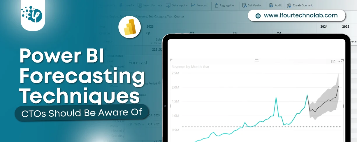
Power BI Forecasting Techniques

Understanding the Forecasting models in Power BI

Power BI doesn't simply guess; it actually uses the ETS (Error, Trend, Seasonality) algorithm for forecasting accuracy.

Now, ETS are of two types here:

- ETS AAA model (also called as “Holt-Winters algorithm”).

- ETS AAN model (also known as “Holt's linear model”).

Both Power BI and Microsoft Excel use these BI forecasting models for Predictive analytics. Depending on the pattern of your historical data, they will automatically pick the best one.

Which model does Power BI use for forecasting?

VS

Vinod Satapara

CTO & Director

iFour Technolab

15+ Years in BI & DevOps

It actually depends on your past data. If your data is non-seasonal, then ETS AAN (Additive Error, Additive Trend, No Seasonality) model is applied.

And for a seasonal pattern, the ETS AAA (Additive Error, Additive Trend, Additive Seasonality) model is applied.

If your forecast looks like a flat line instead of waves, Power BI probably didn't detect seasonality. That means it's using ETS AAN. In that case, you'll need to enforce seasonality manually.

How to do Forecasting in Power BI? (step-by-step)

An important thing to note is that Power BI's built-in forecasting works only on line charts with time-series data. Other Power BI templates, like combo or area charts, don't have this support.

To forecast in Power BI, first, you need to turn on the “Forecast” option. Here is how you can do it:

Selecting line chart (with time-series data) > Analytics Pane > Forecast.

Once done, you can proceed customizing - confidence intervals, forecast length, seasonality, and apply all these changes. Now you'll see predictions for future periods.

Detailed step-by-step guide:

Your data strategy deserves the best. Choose our Azure Synapse Analytics Consulting services .

1. Add a line chart

On your report page, insert a line chart visual.

2. Add time-series data

Drag a date or time field to the X-axis and a numeric value to the Y-axis.

3. Open the Analytics pane

Select the line chart, then choose Analytics (magnifying glass icon) in the Visualizations pane.

4. Add a forecast

Under Forecast, select Add.

5. Customize the forecast

Expand Forecast options to set:

  • Forecast length: How far ahead to predict (for example, 10 points or 12 months). (Tip: Keep this reasonable; long-term forecasts using ETS degrade in accuracy.)
  • Confidence interval: Show a wider or narrower range (for example, 95%).
  • Seasonality: This is a crucial step. If you know your data cycle (e.g., 12 months), enter 12 points manually rather than relying on "Auto." This forces the ETS AAA algorithm.
  • Ignore last period: Exclude the last historical period if needed.

6. Apply changes

Select Apply to update the chart.

Tip: Use a continuous Date axis and clean, consistent granularity (daily, weekly, monthly) for better forecast behavior.

Check this to learn how to use the Analytics pane in Power BI Desktop

How To Measure Power BI Forecasting Accuracy

Forecasting in Power BI is simple, but measuring “how close those predictions are to reality” is where real value - and trust - comes from. Here are the recommended tips to measure Power BI forecasting:

  • Create a DAX measure to calculate forecasting accuracy.
  • Choose a metric such as Mean Absolute Percentage Error (MAPE) or a simple % difference.
  • Apply the measure to compare forecasted values against actual historical data.
  • Use visuals like tables or charts to display accuracy results.
  • Gain insights into how reliable your forecasts are over time.

Need dashboards that drive decisions? Get started with our Dashboard Development Services .

Metrics Used To Forecast Power BI Accuracy

Visualizing a line is easy; proving its accuracy requires statistics. Your Power BI dashboard should tell you exactly what's likely to happen next before your competitors even sense a shift. That's where you get the leap.

To achieve this, you need to master Power BI forecasting techniques.

Given below are some of the best techniques to measure forecasting accuracy in Power BI.

1. Mean Absolute Percentage Error (MAPE)

Best for: Communicating accuracy to stakeholders in plain percentage terms.

Definition: Measures the average percentage deviation between the forecast and the actuals.

Interpretation: A lower MAPE indicates better performance.

To learn more about its technical usage, check this out.

2. Mean Absolute Error (MAE)

Best for: Understanding the average magnitude of errors in absolute units (e.g., dollars or units).

Definition: The average absolute difference between predicted and actual values.

Why use MAE: Unlike RMSE, it does not punish large errors excessively, giving a "linear" view of accuracy.

To learn how to use MAE technically with DAX formulas, visit this.

3. Root Mean Squared Error (RMSE)

Best for: Identifying volatility and penalizing large outliers.

Definition: The square root of the average of squared errors.

Why use RMSE?

If a single bad forecast could be terrible for your business (e.g., stockout), RMSE is the metric to watch because it magnifies large errors.

You can learn more about calculating RMSE in Power BI here.

4. Rolling Forecast Comparison

What it does: Compares forecasts made in previous cycles with actuals from the current cycle.

Why Rolling Forecast is useful: Helps track accuracy over time and adjust models accordingly.

How to use Rolling Forecast: Store historical forecasts and actuals in a matrix or table, then calculate error metrics month-over-month.

Tip: Use matrix visuals with time slicers and error metrics.

Empower leadership with clarity. Explore our CEO Dashboard Development Services now.

5. Visual Accuracy Checks

What it does: Overlay forecast and actual lines in Power BI visuals.

Why it's useful: Quick visual cue to spot divergence or alignment.

How to use Visual Accuracy Checks: Use line charts with dual series — one for actuals, one for forecasts.

Tip: Add confidence intervals or shaded bands to show prediction range.

6. Confidence Interval Analysis

What it does: Evaluates whether actuals fall within the forecast's confidence band.

Why it's useful: Adds context to forecast reliability.

How to use: Use Power BI's built-in forecasting visuals with confidence shading enabled.

Tip: Use shaded areas to communicate uncertainty clearly.

7. Custom Python/R Scripts

Purpose: Advanced statistical validation.

Usage: Integrate external models for deeper diagnostics.

Tip: Use Power BI's Python/R visual to run custom accuracy checks.

Pro Tip:

Combine multiple metrics to get a balanced view - MAPE for interpretability, RMSE for volatility, and visual overlays for stakeholder clarity.

Future-proof your data strategy with a leading Microsoft Fabric Consulting Company .

How to do "What-If" Analysis in Power BI?

Native forecasting is static. To model scenarios (e.g., "What if we grow 10% next year?"), use What-If Parameters.

1. Create Parameter: Go to Modeling > New Parameter > Numeric Range. Name it "Growth Rate" (e.g., 0 to 1 with 0.1 increments).

2. Create Measure: Build a DAX measure that multiplies your previous year's sales by this parameter.

3. Visualize: Add this measure to your chart. Users can now use a slider to see how different growth rates impact the trajectory.

Learn “what-if” analysis in Power BI in detail here.

Power BI Native Forecasting vs. Custom R/Python Visuals

While Power BI's native tool is fast, it has limitations. Use this comparison to decide when to upgrade to R or Python scripts.

Feature Native Power BI Forecast R / Python Custom Visuals
Algorithm ETS (Exponential Smoothing) ARIMA, Prophet, Neural Networks, etc.
Setup Speed Instant (Drag & Drop) Slower (Requires coding)
Flexibility Limited (Seasonality, Horizon) Infinite (Full statistical control)
Performance High (Integrated engine) Lower (Depends on local R/Python environment)

Pro Tip: For most business dashboards, native forecasting is sufficient. If you require ARIMA modeling or external regressors (e.g., forecasting sales based on weather), you must switch to Python or R visuals.

So, that's how decision-makers anticipate the trends effectively. I hope you found this blog informative and helpful.

Want to forecast your business data accurately? Our Power BI consulting services help you do it confidently. Let's connect and discuss your needs.

Power BI Forecasting Techniques: Conclusion

In this blog, we learnt how to do Forecasting in Power BI. We also looked at the setup steps, Power BI forecasting models, and the measures that enable you to turn Power BI into a future-predicting asset.

Forecasting accuracy in Power BI isn't just about numbers - it's about trust. By blending solid metrics like MAPE, MAE, and RMSE with clear visuals and confidence intervals, you create forecasts that stakeholders can rely on.

Add advanced validation with Python or R when needed, and you've got a powerful balance of precision and clarity. That's how you turn Power BI into a dependable tool for smarter planning.

How to Do Forecasting in Power BI (Steps & Accuracy Metrics) Remember our last Power BI forecasting guide? It uncovered what really blocks accuracy. Now it's time to take the next step. Knowing Power BI challenges is just the start - mastering forecasting techniques is what truly moves the needle. In this guide, we will explore how to do forecasting in Power BI accurately. Plus, we will look at the setup steps, the forecasting models that Power BI utilizes, and the measures that enable you to transform Power BI into a future-predicting asset. Understanding the Forecasting models in Power BI Power BI doesn't simply guess; it actually uses the ETS (Error, Trend, Seasonality) algorithm for forecasting accuracy. Now, ETS are of two types here: - ETS AAA model (also called as “Holt-Winters algorithm”). - ETS AAN model (also known as “Holt's linear model”). Both Power BI and Microsoft Excel use these BI forecasting models for Predictive analytics. Depending on the pattern of your historical data, they will automatically pick the best one. Which model does Power BI use for forecasting? VS Vinod Satapara CTO & Director iFour Technolab 15+ Years in BI & DevOps It actually depends on your past data. If your data is non-seasonal, then ETS AAN (Additive Error, Additive Trend, No Seasonality) model is applied. And for a seasonal pattern, the ETS AAA (Additive Error, Additive Trend, Additive Seasonality) model is applied. If your forecast looks like a flat line instead of waves, Power BI probably didn't detect seasonality. That means it's using ETS AAN. In that case, you'll need to enforce seasonality manually. How to do Forecasting in Power BI? (step-by-step) An important thing to note is that Power BI's built-in forecasting works only on line charts with time-series data. Other Power BI templates, like combo or area charts, don't have this support. To forecast in Power BI, first, you need to turn on the “Forecast” option. Here is how you can do it: Selecting line chart (with time-series data) > Analytics Pane > Forecast. Once done, you can proceed customizing - confidence intervals, forecast length, seasonality, and apply all these changes. Now you'll see predictions for future periods. Detailed step-by-step guide: Your data strategy deserves the best. Choose our Azure Synapse Analytics Consulting services . Inquire Now 1. Add a line chart On your report page, insert a line chart visual. 2. Add time-series data Drag a date or time field to the X-axis and a numeric value to the Y-axis. 3. Open the Analytics pane Select the line chart, then choose Analytics (magnifying glass icon) in the Visualizations pane. 4. Add a forecast Under Forecast, select Add. 5. Customize the forecast Expand Forecast options to set: Forecast length: How far ahead to predict (for example, 10 points or 12 months). (Tip: Keep this reasonable; long-term forecasts using ETS degrade in accuracy.) Confidence interval: Show a wider or narrower range (for example, 95%). Seasonality: This is a crucial step. If you know your data cycle (e.g., 12 months), enter 12 points manually rather than relying on "Auto." This forces the ETS AAA algorithm. Ignore last period: Exclude the last historical period if needed. 6. Apply changes Select Apply to update the chart. Tip: Use a continuous Date axis and clean, consistent granularity (daily, weekly, monthly) for better forecast behavior. Read More: 16 Power BI Dashboard Design Mistakes to Avoid Check this to learn how to use the Analytics pane in Power BI Desktop How To Measure Power BI Forecasting Accuracy Forecasting in Power BI is simple, but measuring “how close those predictions are to reality” is where real value - and trust - comes from. Here are the recommended tips to measure Power BI forecasting: Create a DAX measure to calculate forecasting accuracy. Choose a metric such as Mean Absolute Percentage Error (MAPE) or a simple % difference. Apply the measure to compare forecasted values against actual historical data. Use visuals like tables or charts to display accuracy results. Gain insights into how reliable your forecasts are over time. Need dashboards that drive decisions? Get started with our Dashboard Development Services . Contact Now Metrics Used To Forecast Power BI Accuracy Visualizing a line is easy; proving its accuracy requires statistics. Your Power BI dashboard should tell you exactly what's likely to happen next before your competitors even sense a shift. That's where you get the leap. To achieve this, you need to master Power BI forecasting techniques. Given below are some of the best techniques to measure forecasting accuracy in Power BI. 1. Mean Absolute Percentage Error (MAPE) Best for: Communicating accuracy to stakeholders in plain percentage terms. Definition: Measures the average percentage deviation between the forecast and the actuals. Interpretation: A lower MAPE indicates better performance. To learn more about its technical usage, check this out. 2. Mean Absolute Error (MAE) Best for: Understanding the average magnitude of errors in absolute units (e.g., dollars or units). Definition: The average absolute difference between predicted and actual values. Why use MAE: Unlike RMSE, it does not punish large errors excessively, giving a "linear" view of accuracy. Read More: 17 Power BI Myths and Misconceptions Busted | Uncover the Truth To learn how to use MAE technically with DAX formulas, visit this. 3. Root Mean Squared Error (RMSE) Best for: Identifying volatility and penalizing large outliers. Definition: The square root of the average of squared errors. Why use RMSE? If a single bad forecast could be terrible for your business (e.g., stockout), RMSE is the metric to watch because it magnifies large errors. You can learn more about calculating RMSE in Power BI here. 4. Rolling Forecast Comparison What it does: Compares forecasts made in previous cycles with actuals from the current cycle. Why Rolling Forecast is useful: Helps track accuracy over time and adjust models accordingly. How to use Rolling Forecast: Store historical forecasts and actuals in a matrix or table, then calculate error metrics month-over-month. Tip: Use matrix visuals with time slicers and error metrics. Empower leadership with clarity. Explore our CEO Dashboard Development Services now. Inquire Now 5. Visual Accuracy Checks What it does: Overlay forecast and actual lines in Power BI visuals. Why it's useful: Quick visual cue to spot divergence or alignment. How to use Visual Accuracy Checks: Use line charts with dual series — one for actuals, one for forecasts. Tip: Add confidence intervals or shaded bands to show prediction range. 6. Confidence Interval Analysis What it does: Evaluates whether actuals fall within the forecast's confidence band. Why it's useful: Adds context to forecast reliability. How to use: Use Power BI's built-in forecasting visuals with confidence shading enabled. Tip: Use shaded areas to communicate uncertainty clearly. Read More: 4 Types of Power BI Dashboards: Analytical, Strategic, Operational, and Tactical 7. Custom Python/R Scripts Purpose: Advanced statistical validation. Usage: Integrate external models for deeper diagnostics. Tip: Use Power BI's Python/R visual to run custom accuracy checks. Pro Tip: Combine multiple metrics to get a balanced view - MAPE for interpretability, RMSE for volatility, and visual overlays for stakeholder clarity. Future-proof your data strategy with a leading Microsoft Fabric Consulting Company . Begin Now How to do "What-If" Analysis in Power BI? Native forecasting is static. To model scenarios (e.g., "What if we grow 10% next year?"), use What-If Parameters. 1. Create Parameter: Go to Modeling > New Parameter > Numeric Range. Name it "Growth Rate" (e.g., 0 to 1 with 0.1 increments). 2. Create Measure: Build a DAX measure that multiplies your previous year's sales by this parameter. 3. Visualize: Add this measure to your chart. Users can now use a slider to see how different growth rates impact the trajectory. Learn “what-if” analysis in Power BI in detail here. Read More: 10 Executive Dashboard Examples for Consultants and CEOs Power BI Native Forecasting vs. Custom R/Python Visuals While Power BI's native tool is fast, it has limitations. Use this comparison to decide when to upgrade to R or Python scripts. Feature Native Power BI Forecast R / Python Custom Visuals Algorithm ETS (Exponential Smoothing) ARIMA, Prophet, Neural Networks, etc. Setup Speed Instant (Drag & Drop) Slower (Requires coding) Flexibility Limited (Seasonality, Horizon) Infinite (Full statistical control) Performance High (Integrated engine) Lower (Depends on local R/Python environment) Pro Tip: For most business dashboards, native forecasting is sufficient. If you require ARIMA modeling or external regressors (e.g., forecasting sales based on weather), you must switch to Python or R visuals. So, that's how decision-makers anticipate the trends effectively. I hope you found this blog informative and helpful. Want to forecast your business data accurately? Our Power BI consulting services help you do it confidently. Let's connect and discuss your needs. Power BI Forecasting Techniques: Conclusion In this blog, we learnt how to do Forecasting in Power BI. We also looked at the setup steps, Power BI forecasting models, and the measures that enable you to turn Power BI into a future-predicting asset. Forecasting accuracy in Power BI isn't just about numbers - it's about trust. By blending solid metrics like MAPE, MAE, and RMSE with clear visuals and confidence intervals, you create forecasts that stakeholders can rely on. Add advanced validation with Python or R when needed, and you've got a powerful balance of precision and clarity. That's how you turn Power BI into a dependable tool for smarter planning.
Kapil Panchal

Kapil Panchal

A passionate Technical writer and an SEO freak working as a Content Development Manager at iFour Technolab, USA. With extensive experience in IT, Services, and Product sectors, I relish writing about technology and love sharing exceptional insights on various platforms. I believe in constant learning and am passionate about being better every day.

Access the Full EBook here!

Want Faster Power BI Reports?

This eBook shows you how.

Build Your Agile Team

Categories

Ensure your sustainable growth with our team

Talk to our experts
Sustainable
Sustainable
 
Blog Our insights
How to Do Forecasting in Power BI (Steps & Accuracy Metrics)

02 December 2025

Kapil Panchal

How to Do Forecasting in Power BI (Steps & Accuracy Metrics)

Remember our last Power BI forecasting guide? It uncovered what really blocks accuracy. Now it's time to take the next step. Knowing Power BI challenges is just the start - mastering...

ETL vs ELT: Key Differences, Benefits & Use Cases Explained

26 November 2025

Kapil Panchal

ETL vs ELT: Key Differences, Benefits & Use Cases Explained

It's amazing to see how Data teams today are racing ahead - moving from traditional warehouses to cloud-native platforms, lakehouses, and real-time architectures. But in this rush,...
Modernizing applications with the 7 R strategy – A CTO’s Guide

16 October 2025

Lochan Paliwal

Modernizing applications with the 7 R strategy – A CTO’s Guide

Think about the last time CTOs spent most of their time fixing old systems. Updates were slow, servers were expensive, and adding new features took time. Now, things have changed....