One interesting aspect you truly love about Power BI, as a CTO, is how it lets you step back and see the bigger picture of your business. Isn’t it? Without getting bogged down in minute details, it helps you learn what’s working and what’s not for your business without wasting time.
Here’s how it works: It effortlessly pulls data from multiple sources—be it performance metrics, SEO traffic, or company transactions and converts it into clear, actionable reports that make decision-making smoother.
Let’s delve further and see what types of Power BI dashboards you can build with Power BI and who can make the most out of them.
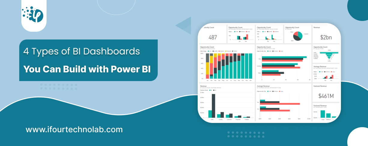
4 Types of BI Dashboards You Can Build with Power BI
Power BI makes it easy to build dashboards that provide actionable insights for any level of business activity. You can build 4 different types of dashboards in Power BI:
- Strategic Dashboards
- Operational Dashboards
- Analytical Dashboards
- Tactical Dashboards
Power BI dashboard types come in various forms, each with a unique purpose. Let’s walk through them using specific Power BI dashboard examples.
1. Strategic Dashboards
Strategic Dashboards are designed to provide high-level insights for executives and key decision-makers, focusing on long-term goals and overall business performance. These dashboards typically include key performance indicators, trends and forecasts that help track the organization's progress toward its strategic objectives.
The primary purpose of strategic dashboards is to give a quick overview of the company's performance and highlight areas that need attention ensuring leadership can make informed decisions.
Key takeaways for strategic dashboards
- Allows data visualization using charts, graphs, scorecards, etc.
- Covers functions aligned with financial performance, market trends, customer satisfaction and growth opportunities.
- Helps to monitor business health, identify risks/opportunities, and align resources.
Simplify your data journey with our Power BI consulting services today!
Benefits of Location Intelligence
Below are some prime examples of BI dashboard types categorized under Strategic dashboards.
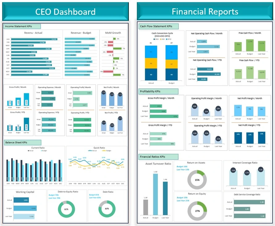
a. CEO Dashboard
The objective of using the CEO Dashboard is to track the overall health of your company, its growth rates, and key performance indicators (KPIs) to support high-level decision-making.
Key Metrics to monitor for strategic decisions
- Revenue Growth: It measures the growth in company revenue over time, reflecting the business's financial health.
- Market Share: Displays the company’s portion of the market compared to competitors.
- Customer Acquisition: Tracks the number of new customers or clients, indicating business expansion and sales performance.
Primary Users of the CEO Dashboard
- CEO
- Board Members
- Executive Leadership Team
Primary Users of the CEO Dashboard
Provides a snapshot of company performance, helping leadership understand the company.
- Strategic Discussions: Supports high-level, data-driven discussions during board meetings and strategy sessions.
- Trend Analysis Allows for real-time monitoring of critical KPIs, enabling quick adjustments to strategies.
Data Visualizations
- Line Graphs: Show trends in revenue growth and customer acquisition over time, helping users identify patterns and project future performance.
- Bar Charts: Track month-over-month or quarter-over-quarter performance, offering quick insights into operational changes and growth rates.
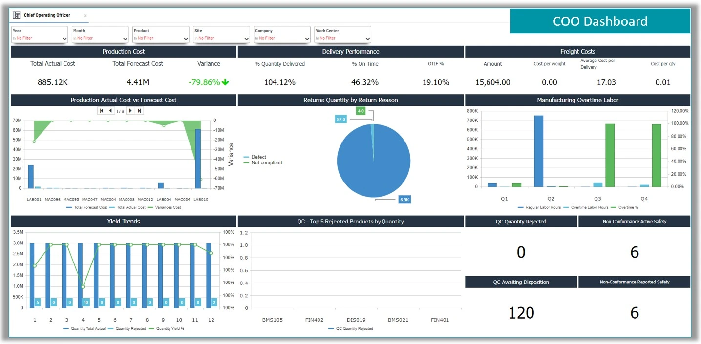
b. COO Dashboard
This type of Power BI dashboard helps you track and improve your company’s operations, making sure the resources are used efficiently and productivity is maximized.
Key Metrics to Track for Informed Decisions
- Resource Allocation: It Shows how the company resources like employees, equipment, and budget are being distributed across different tasks or departments.
- Cost per Operation: Measures how much it costs to complete each task or process. This helps to identify where costs can be reduced.
- Throughput: Tracks how much work or production happens within a specific period, helping to measure efficiency.
Unlock powerful insights hire Power BI developers from iFour
Use Cases of COO Dashboard
- Improving Operational Workflows: By Identifying bottlenecks or inefficiencies it processes to make workflows smoother and faster.
- Optimizing Resource Deployment: It Ensures resources are used in the most effective way, minimizing waste and maximizing output.
Data Visualizations supported
- Heatmaps: Visual representations that show where resources are being used most or least. This helps in identifying areas that need more attention or resources.
- Efficiency Bar Charts: Compare different departments or processes based on how efficient they are. This helps in pinpointing which areas are performing well and which need improvement.
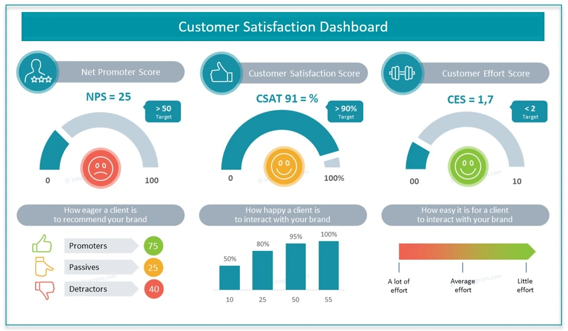
c. Customer Satisfaction Dashboard
Focuses on gathering and analyzing customer feedback to improve the customer experience and drive customer-centric strategies.
Key Metrics to Track for Informed Decisions
- NPS Score (Net Promoter Score): It Measures customer loyalty by asking how likely customers are to recommend the company to others.
- Feedback Trends Tracks the volume and sentiment of customer feedback over time, helping to identify any patterns or shifts in customer satisfaction.
- Shows how quickly and effectively customer complaints are being addressed and resolved.
Primary Users of the Customer Satisfaction Dashboard
- Customer Experience Team: Focuses on improving the overall experience for customers.
- Chief Customer Officer: Oversees customer satisfaction and ensures the company’s customer strategies are aligned with business goals.
Benefits of Customer Satisfaction Dashboard
- Customer-Centric Strategies: Allows the user to segment feedback by customer age, location, or other demographics to understand how different groups perceive the company.
- Sentiment Tracking: Users can filter feedback by typing e.g., product-related, service-related to focus on specific areas of improvement.
Achieve seamless integration through expert Power Platform consulting
2. Operational Dashboards
Focuses on tracking day-to-day metrics and monitoring business processes in real time to ensure smooth operations.
Examples of Operational Dashboards
Listed below are examples of operational dashboards, a key category in the types of BI dashboards.
-
Business Operations Dashboards Provides up-to-the-minute insights to support daily operations and manage workflow efficiently.
Key Metrics to track for informed decisions
- Task Completion Rate: Shows the percentage of tasks completed, allowing teams to monitor productivity and identify any delays.
- Current Project Statuses: Displays the real-time progress of ongoing projects, helping teams stay aligned with deadlines and goals.
Primary Users
- Operations Manager: Responsible for overseeing daily operations and ensuring all tasks stay on schedule.
- Supervisors: Monitor team performance and address any roadblocks in the workflow.
Drill-Down Capabilities
- Interactive Views by Project or Team: It enables users to click into specific projects or teams, providing detailed insights for more focused analysis and targeted action.
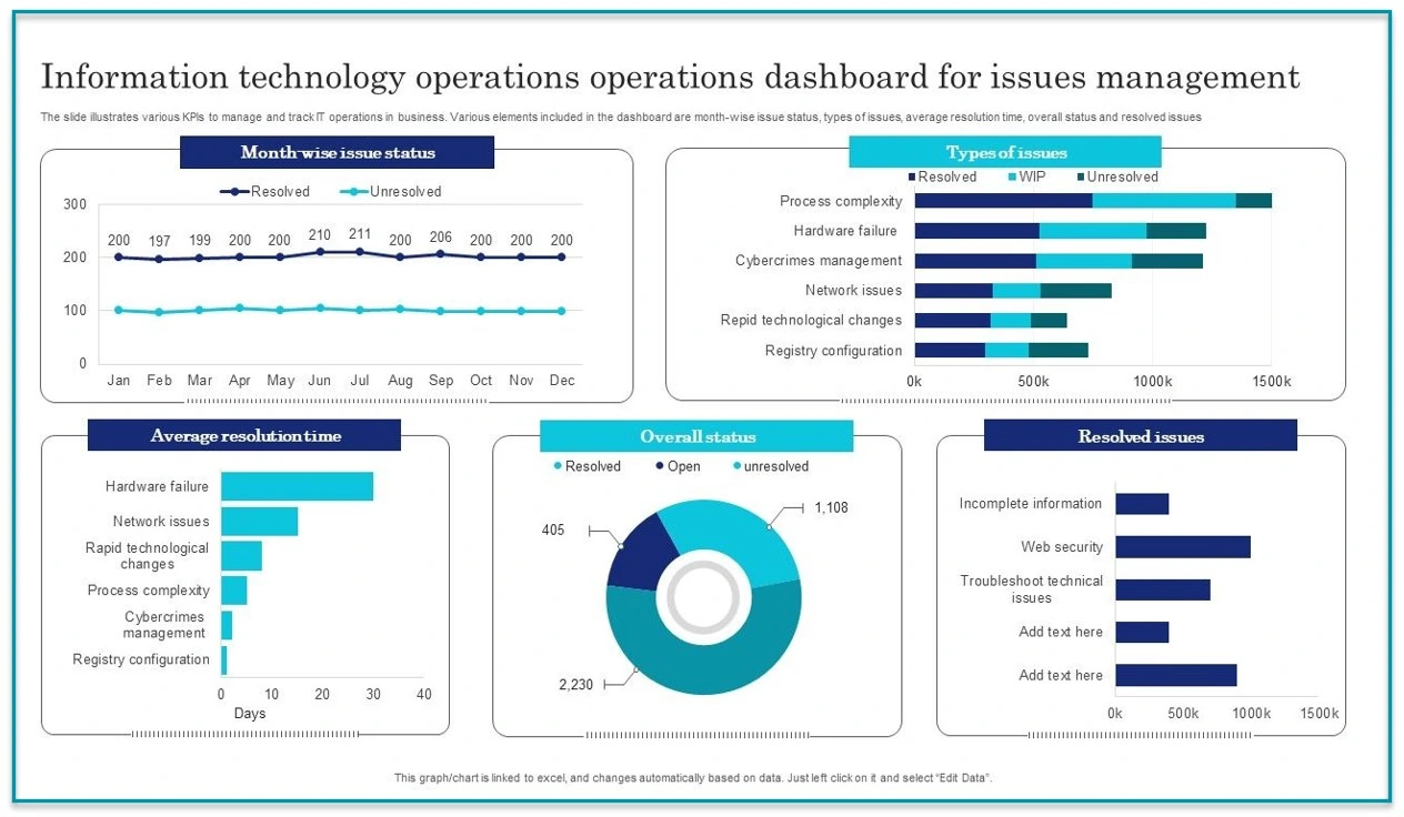
IT Infrastructure Dashboard
Provides a comprehensive view of IT infrastructure performance to maintain stability, minimize downtime, and ensure efficient network operations.
Use Cases
- Allows IT teams to monitor the health of servers, networks, and other critical infrastructure to keep systems running smoothly.
- Helps identify and resolve potential issues before they lead to downtime, improving reliability and user experience.
Key Metrics
- Server Response Time: Measures how quickly servers respond to requests, indicating the speed and performance of the network.
- Downtime Occurrences: Tracks any instances of system or network downtime by helping teams address and reduce future occurrences.
Visualizations
- Real-Time Gauges: Show current network status, response times, and other metrics at a glance.
- System Load Trends: Display historical data on system load, helping identify patterns and plan for future capacity needs.
Frequency of Updates
- Real-Time Updates: Provides live data for continuous monitoring, allowing the IT team to quickly respond to any issues as they arise.
Boost productivity with expert Power Automate consulting services. from iFour
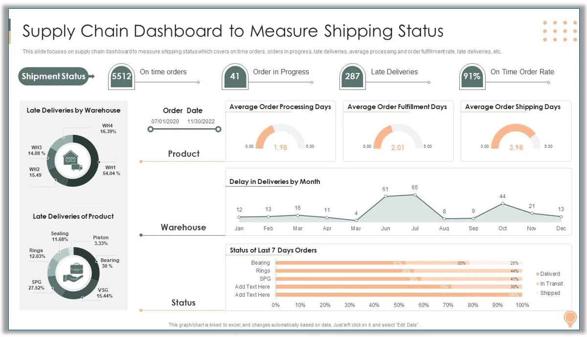
Supply Chain Overview Dashboard
Provides a comprehensive view of the supply chain, tracking suppliers, deliveries, and lead times to ensure efficient and timely operations.
Key Metrics
- Lead Time: Measures the time taken from placing an order to receiving the goods, helping to identify and improve delivery times.
- Order Accuracy: Tracks the accuracy of delivered orders, indicating if the correct items and quantities are consistently received.
- Supplier Performance: Evaluates suppliers based on reliability, quality, and delivery speed, allowing the team to prioritize dependable partners.
Primary Users
- Supply Chain Managers: Responsible for overseeing supplier relationships and ensuring smooth operations.
- Logistics Team: Manages the coordination of deliveries and helps maintain optimal lead times.
Benefits
- Streamlined Supplier Monitoring: Makes it easy to evaluate and compare supplier performance, allowing the team to address issues with underperforming suppliers.
- Reliable Delivery Schedules: By tracking lead times and order accuracy, this dashboard helps reduce delays and improve the reliability of delivery schedules
3. Analytical Dashboards
Designed for deep data exploration, advanced analytics, and trend analysis, helping users uncover valuable insights and make data-driven decisions.
Analytical BI Dashboards Examples
Here are a few examples of analytical types of BI dashboards.
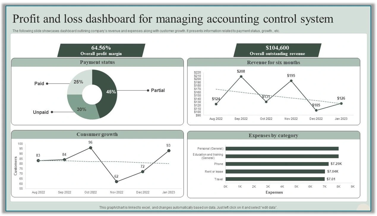
Profit & Loss Dashboard
Shows income, expenses, and net profit trends.
Primary Users
- Financial Analysts: Analyze financial data to spot trends, evaluate performance, and support budgeting.
- Chief Financial Officer: who uses it to oversee the company’s financial health, align resources with strategic goals, and make informed budget adjustments.
Benefits
- In-Depth Financial Health Analysis: Offers a vast view of profitability over time by allowing teams to identify areas for cost control or revenue growth.
- Guides Budget Adjustments: By tracking trends the dashboard helps leaders make data-driven decisions on budget allocations and financial planning.
- Quarterly, Regional, or Departmental Breakdown: Allows users to explore financial metrics at different levels helping to uncover trends within specific departments or regions and enabling more granular analysis of income and expenses.
Build cross-platform apps with a top-class .NET MAUI development company
Frequency of Updates
- Monthly or Quarterly Consistent updates ensure data reflects current trends, while providing a long-term view for trend analysis.
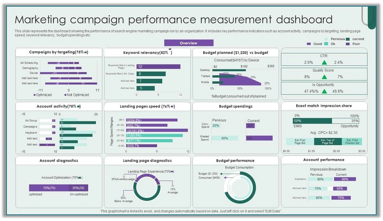
Campaign Performance Dashboard
This dashboard gives a comprehensive view of campaign ROI, tracking metrics like cost per lead and conversion rates.
Key Metrics
- Tracks lead generation cost and conversion rates by marketing channel to measure efficiency.
Primary Users
- Designed for marketing managers and campaign strategists who assess campaign success.
Use Cases
- Helps evaluate the effectiveness of campaigns and guides decisions on budget reallocation to maximize ROI.
Visualizations
- Includes conversion funnels to show the customer journey and heatmaps to display channel performance.
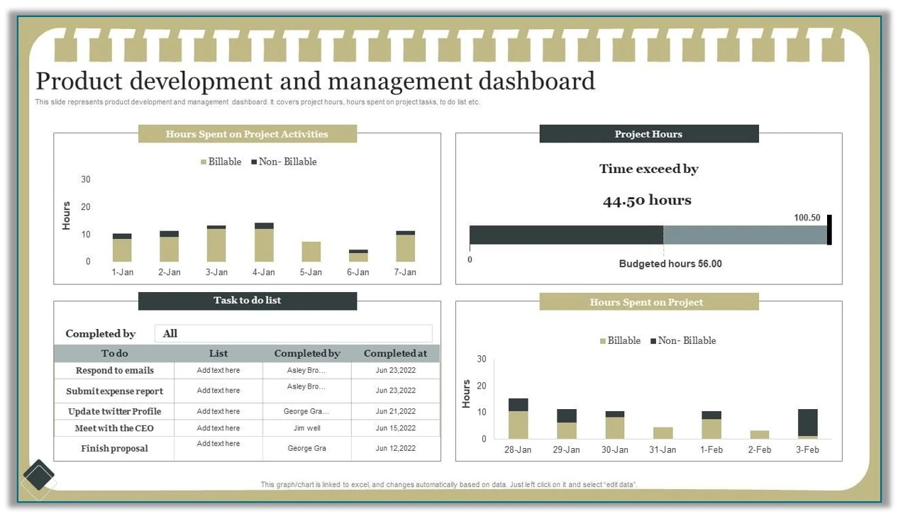
Product Development Dashboard
This dashboard focuses on tracking R&D project phases, costs, and milestones to support effective product development.
Key Metrics
- Monitors project timelines, budget adherence, and phase completion rates to ensure progress stays on track.
Primary Users
- Used by the R&D department and product managers to oversee development activities.
Benefits
- Provides a clear view of R&D progress, helping ensure products launch on time.
Visualizations
- Features Gantt charts to outline project phases and trend lines to track costs.
Interactivity
- Allows drill-down into specific projects or phases for a detailed view of progress.
4. Tactical Dashboards
Focus on tracking performance and optimizing processes to meet medium goals, helping teams make adjustments that drive steady progress.
Examples of Tactical Dashboards
Below are some examples showcasing the tactical types of BI dashboards.
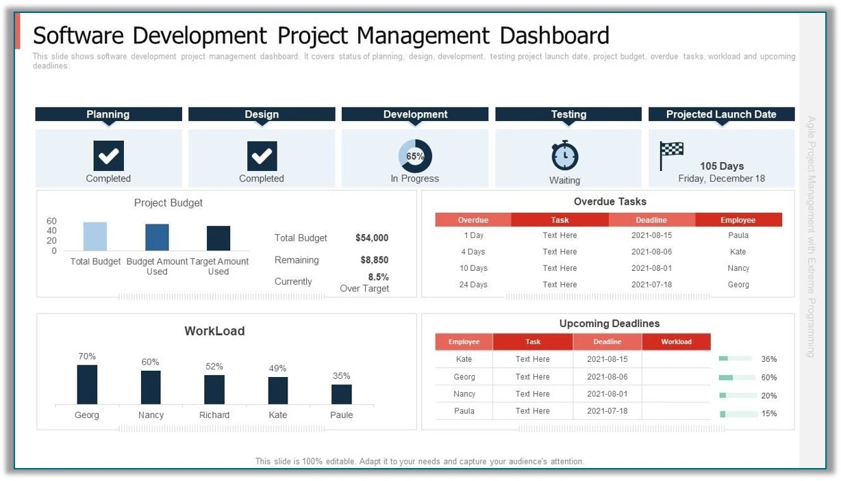
Project Management Dashboard
It helps you monitor project progress, allocate resources, and tasks using real-time data and clear visuals.
Key Metrics
- It Tracks task progress and milestone completion rates to ensure project timelines are met.
Primary Users
- Primarily used by project managers and team leads to oversee project status.
Benefits
- Helps keep projects on schedule by showing milestone statuses and resource usage.
Visualizations
- Uses Gantt charts to display timelines and pie charts for visualizing resource allocation.
Frequency of Updates
- Updated weekly to provide an accurate view of short-term project progress..
Transform your ideas into reality with a leading Vue.js development company
Employee Performance Dashboard
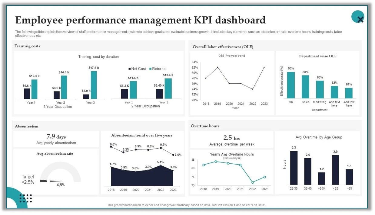
This dashboard provides a snapshot of both individual and team productivity levels, helping leaders monitor overall performance.
Key Metrics
- Tracks important metrics such as KPI completion rates and productivity scores, offering insight into how well employees are meeting objectives.
Primary Users
- Primarily used by HR managers and team leaders to evaluate performance and support workforce planning.
Use Cases
- Supports assessing employee performance for setting new goals or developing targeted improvement plans based on productivity trends.
Visualizations
- Includes bar charts to visualize team productivity levels and comparison charts for viewing individual metrics side-by-side.
Interactivity
- Offers filters by department or role, enabling users to drill down for focused insights on specific teams or job functions.
Budget vs. Actual Dashboard
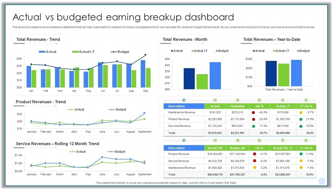
Budget Adherence and Variance Analysis keeps an eye on how closely spending matches the budget, pointing out any differences.
Compares Planned vs. Actual Spending
- Analyzes the difference between projected and actual expenses, providing insights into financial discrepancies and trends.
Primary Users
- Primarily used by budget analysts and department heads to ensure financial goals are met
Use Cases
- Helps ensure budget control and alignment with quarterly financial goals.
Visualizations
- Includes line charts to display budget vs. actual trends and heatmaps to highlight variance across different categories.
- So, these are the standout examples of 4 BI dashboard types. Hope you find them helpful.
Types of Business Intelligence Dashboards - Summary
Choosing the right dashboard type is crucial to fulfilling your corporate needs while keeping your team informed about your specific goals. Besides the kind of dashboard you choose, it's important to create it clearly and concisely - that even a non-tech person can understand.
In this blog, we learned about the types of Power BI dashboards we can build using Power BI. We also walked through the sub-types of each and how they help with data-driven decision-making specifically. We hope you found this blog useful.
Not sure which type of BI dashboard to choose? Reach out to iFour, a top Power BI consulting companyand let them help you figure out what you need.
FAQs on BI Dashboard Types
1. How to build a Power BI dashboard?
To build a Power BI dashboard, connect the data sources, design visualizations using drag-and-drop features, and arrange them on a single canvas for insights.
2. What is the dashboard structure of Power BI?
The Power BI dashboard structure consists of tiles that display visualizations like charts, graphs, and tables, arranged on a single canvas for easy data analysis.
3. What is KPI in Power BI?
A KPI (Key Performance Indicator) in Power BI is a visual element that tracks the progress of a metric towards a defined goal, providing insights into performance.
4. What are the limitations of Power BI dashboard?
Some of the top Power BI limitations include:
- Data Volume and Performance Issues
- Real-Time Data Refresh Challenges
- Internet Dependency for Access
- Limited Interactivity on Mobile
- Constraints on Custom Visuals Development
- Complex Licensing for Advanced Features
5. What are the types of Power BI platforms?
Basically, there are three types of Power BI platforms available.
- Power BI Desktop
- Power BI mobile
- Power BI services
Each of these platforms has slight variations in how Power BI is used.
4 Types of Power BI Dashboards: Analytical, Strategic, Operational, and Tactical One interesting aspect you truly love about Power BI, as a CTO, is how it lets you step back and see the bigger picture of your business. Isn’t it? Without getting bogged down in minute details, it helps you learn what’s working and what’s not for your business without wasting time. Here’s how it works: It effortlessly pulls data from multiple sources—be it performance metrics, SEO traffic, or company transactions and converts it into clear, actionable reports that make decision-making smoother. Let’s delve further and see what types of Power BI dashboards you can build with Power BI and who can make the most out of them. 4 Types of BI Dashboards You Can Build with Power BI Power BI makes it easy to build dashboards that provide actionable insights for any level of business activity. You can build 4 different types of dashboards in Power BI: Strategic Dashboards Operational Dashboards Analytical Dashboards Tactical Dashboards Power BI dashboard types come in various forms, each with a unique purpose. Let’s walk through them using specific Power BI dashboard examples. 1. Strategic Dashboards Strategic Dashboards are designed to provide high-level insights for executives and key decision-makers, focusing on long-term goals and overall business performance. These dashboards typically include key performance indicators, trends and forecasts that help track the organization's progress toward its strategic objectives. The primary purpose of strategic dashboards is to give a quick overview of the company's performance and highlight areas that need attention ensuring leadership can make informed decisions. Key takeaways for strategic dashboards Allows data visualization using charts, graphs, scorecards, etc. Covers functions aligned with financial performance, market trends, customer satisfaction and growth opportunities. Helps to monitor business health, identify risks/opportunities, and align resources. Simplify your data journey with our Power BI consulting services today! Get started now Benefits of Location Intelligence Below are some prime examples of BI dashboard types categorized under Strategic dashboards. a. CEO Dashboard The objective of using the CEO Dashboard is to track the overall health of your company, its growth rates, and key performance indicators (KPIs) to support high-level decision-making. Image source Key Metrics to monitor for strategic decisions Revenue Growth: It measures the growth in company revenue over time, reflecting the business's financial health. Market Share: Displays the company’s portion of the market compared to competitors. Customer Acquisition: Tracks the number of new customers or clients, indicating business expansion and sales performance. Primary Users of the CEO Dashboard CEO Board Members Executive Leadership Team Primary Users of the CEO Dashboard Provides a snapshot of company performance, helping leadership understand the company. Strategic Discussions: Supports high-level, data-driven discussions during board meetings and strategy sessions. Trend Analysis Allows for real-time monitoring of critical KPIs, enabling quick adjustments to strategies. Read More: 19 Power BI Case Studies That Showcase Real-World Success Data Visualizations Line Graphs: Show trends in revenue growth and customer acquisition over time, helping users identify patterns and project future performance. Bar Charts: Track month-over-month or quarter-over-quarter performance, offering quick insights into operational changes and growth rates. b. COO Dashboard This type of Power BI dashboard helps you track and improve your company’s operations, making sure the resources are used efficiently and productivity is maximized. Image source Key Metrics to Track for Informed Decisions Resource Allocation: It Shows how the company resources like employees, equipment, and budget are being distributed across different tasks or departments. Cost per Operation: Measures how much it costs to complete each task or process. This helps to identify where costs can be reduced. Throughput: Tracks how much work or production happens within a specific period, helping to measure efficiency. Unlock powerful insights hire Power BI developers from iFour Let’s Connect Use Cases of COO Dashboard Improving Operational Workflows: By Identifying bottlenecks or inefficiencies it processes to make workflows smoother and faster. Optimizing Resource Deployment: It Ensures resources are used in the most effective way, minimizing waste and maximizing output. Data Visualizations supported Heatmaps: Visual representations that show where resources are being used most or least. This helps in identifying areas that need more attention or resources. Efficiency Bar Charts: Compare different departments or processes based on how efficient they are. This helps in pinpointing which areas are performing well and which need improvement. c. Customer Satisfaction Dashboard Focuses on gathering and analyzing customer feedback to improve the customer experience and drive customer-centric strategies. Image source Key Metrics to Track for Informed Decisions NPS Score (Net Promoter Score): It Measures customer loyalty by asking how likely customers are to recommend the company to others. Feedback Trends Tracks the volume and sentiment of customer feedback over time, helping to identify any patterns or shifts in customer satisfaction. Shows how quickly and effectively customer complaints are being addressed and resolved. Read More: Power BI Forecasting Challenges and Solutions Primary Users of the Customer Satisfaction Dashboard Customer Experience Team: Focuses on improving the overall experience for customers. Chief Customer Officer: Oversees customer satisfaction and ensures the company’s customer strategies are aligned with business goals. Benefits of Customer Satisfaction Dashboard Customer-Centric Strategies: Allows the user to segment feedback by customer age, location, or other demographics to understand how different groups perceive the company. Sentiment Tracking: Users can filter feedback by typing e.g., product-related, service-related to focus on specific areas of improvement. Achieve seamless integration through expert Power Platform consulting Connect now 2. Operational Dashboards Focuses on tracking day-to-day metrics and monitoring business processes in real time to ensure smooth operations. Examples of Operational Dashboards Listed below are examples of operational dashboards, a key category in the types of BI dashboards. Business Operations Dashboards Provides up-to-the-minute insights to support daily operations and manage workflow efficiently. Key Metrics to track for informed decisions Task Completion Rate: Shows the percentage of tasks completed, allowing teams to monitor productivity and identify any delays. Current Project Statuses: Displays the real-time progress of ongoing projects, helping teams stay aligned with deadlines and goals. Image source Primary Users Operations Manager: Responsible for overseeing daily operations and ensuring all tasks stay on schedule. Supervisors: Monitor team performance and address any roadblocks in the workflow. Read More: How to Automate Power BI Reports Using Power Automate Drill-Down Capabilities Interactive Views by Project or Team: It enables users to click into specific projects or teams, providing detailed insights for more focused analysis and targeted action. IT Infrastructure Dashboard Provides a comprehensive view of IT infrastructure performance to maintain stability, minimize downtime, and ensure efficient network operations. Use Cases Allows IT teams to monitor the health of servers, networks, and other critical infrastructure to keep systems running smoothly. Helps identify and resolve potential issues before they lead to downtime, improving reliability and user experience. Key Metrics Server Response Time: Measures how quickly servers respond to requests, indicating the speed and performance of the network. Downtime Occurrences: Tracks any instances of system or network downtime by helping teams address and reduce future occurrences. Visualizations Real-Time Gauges: Show current network status, response times, and other metrics at a glance. System Load Trends: Display historical data on system load, helping identify patterns and plan for future capacity needs. Frequency of Updates Real-Time Updates: Provides live data for continuous monitoring, allowing the IT team to quickly respond to any issues as they arise. Boost productivity with expert Power Automate consulting services. from iFour Let’s Connect Supply Chain Overview Dashboard Provides a comprehensive view of the supply chain, tracking suppliers, deliveries, and lead times to ensure efficient and timely operations. Image source Key Metrics Lead Time: Measures the time taken from placing an order to receiving the goods, helping to identify and improve delivery times. Order Accuracy: Tracks the accuracy of delivered orders, indicating if the correct items and quantities are consistently received. Supplier Performance: Evaluates suppliers based on reliability, quality, and delivery speed, allowing the team to prioritize dependable partners. Primary Users Supply Chain Managers: Responsible for overseeing supplier relationships and ensuring smooth operations. Logistics Team: Manages the coordination of deliveries and helps maintain optimal lead times. Benefits Streamlined Supplier Monitoring: Makes it easy to evaluate and compare supplier performance, allowing the team to address issues with underperforming suppliers. Reliable Delivery Schedules: By tracking lead times and order accuracy, this dashboard helps reduce delays and improve the reliability of delivery schedules Read More: Tableau to Power BI Migration – A Comprehensive Guide 3. Analytical Dashboards Designed for deep data exploration, advanced analytics, and trend analysis, helping users uncover valuable insights and make data-driven decisions. Analytical BI Dashboards Examples Here are a few examples of analytical types of BI dashboards. Profit & Loss Dashboard Shows income, expenses, and net profit trends. Image source Primary Users Financial Analysts: Analyze financial data to spot trends, evaluate performance, and support budgeting. Chief Financial Officer: who uses it to oversee the company’s financial health, align resources with strategic goals, and make informed budget adjustments. Benefits In-Depth Financial Health Analysis: Offers a vast view of profitability over time by allowing teams to identify areas for cost control or revenue growth. Guides Budget Adjustments: By tracking trends the dashboard helps leaders make data-driven decisions on budget allocations and financial planning. Quarterly, Regional, or Departmental Breakdown: Allows users to explore financial metrics at different levels helping to uncover trends within specific departments or regions and enabling more granular analysis of income and expenses. Build cross-platform apps with a top-class .NET MAUI development company Connect now Frequency of Updates Monthly or Quarterly Consistent updates ensure data reflects current trends, while providing a long-term view for trend analysis. Campaign Performance Dashboard This dashboard gives a comprehensive view of campaign ROI, tracking metrics like cost per lead and conversion rates. Image source Key Metrics Tracks lead generation cost and conversion rates by marketing channel to measure efficiency. Primary Users Designed for marketing managers and campaign strategists who assess campaign success. Use Cases Helps evaluate the effectiveness of campaigns and guides decisions on budget reallocation to maximize ROI. Visualizations Includes conversion funnels to show the customer journey and heatmaps to display channel performance. Product Development Dashboard This dashboard focuses on tracking R&D project phases, costs, and milestones to support effective product development. Image source Key Metrics Monitors project timelines, budget adherence, and phase completion rates to ensure progress stays on track. Primary Users Used by the R&D department and product managers to oversee development activities. Benefits Provides a clear view of R&D progress, helping ensure products launch on time. Visualizations Features Gantt charts to outline project phases and trend lines to track costs. Interactivity Allows drill-down into specific projects or phases for a detailed view of progress. 4. Tactical Dashboards Focus on tracking performance and optimizing processes to meet medium goals, helping teams make adjustments that drive steady progress. Examples of Tactical Dashboards Below are some examples showcasing the tactical types of BI dashboards. Project Management Dashboard It helps you monitor project progress, allocate resources, and tasks using real-time data and clear visuals. Image source Key Metrics It Tracks task progress and milestone completion rates to ensure project timelines are met. Primary Users Primarily used by project managers and team leads to oversee project status. Benefits Helps keep projects on schedule by showing milestone statuses and resource usage. Visualizations Uses Gantt charts to display timelines and pie charts for visualizing resource allocation. Frequency of Updates Updated weekly to provide an accurate view of short-term project progress.. Transform your ideas into reality with a leading Vue.js development company Let’s Discuss Employee Performance Dashboard This dashboard provides a snapshot of both individual and team productivity levels, helping leaders monitor overall performance. Image source Key Metrics Tracks important metrics such as KPI completion rates and productivity scores, offering insight into how well employees are meeting objectives. Primary Users Primarily used by HR managers and team leaders to evaluate performance and support workforce planning. Use Cases Supports assessing employee performance for setting new goals or developing targeted improvement plans based on productivity trends. Visualizations Includes bar charts to visualize team productivity levels and comparison charts for viewing individual metrics side-by-side. Interactivity Offers filters by department or role, enabling users to drill down for focused insights on specific teams or job functions. Read More: Location Intelligence Use Cases, and Benefits Budget vs. Actual Dashboard Budget Adherence and Variance Analysis keeps an eye on how closely spending matches the budget, pointing out any differences. Image source Compares Planned vs. Actual Spending Analyzes the difference between projected and actual expenses, providing insights into financial discrepancies and trends. Primary Users Primarily used by budget analysts and department heads to ensure financial goals are met Use Cases Helps ensure budget control and alignment with quarterly financial goals. Visualizations Includes line charts to display budget vs. actual trends and heatmaps to highlight variance across different categories. So, these are the standout examples of 4 BI dashboard types. Hope you find them helpful. Types of Business Intelligence Dashboards - Summary Choosing the right dashboard type is crucial to fulfilling your corporate needs while keeping your team informed about your specific goals. Besides the kind of dashboard you choose, it's important to create it clearly and concisely - that even a non-tech person can understand. In this blog, we learned about the types of Power BI dashboards we can build using Power BI. We also walked through the sub-types of each and how they help with data-driven decision-making specifically. We hope you found this blog useful. Not sure which type of BI dashboard to choose? Reach out to iFour, a top Power BI consulting companyand let them help you figure out what you need. FAQs on BI Dashboard Types 1. How to build a Power BI dashboard? To build a Power BI dashboard, connect the data sources, design visualizations using drag-and-drop features, and arrange them on a single canvas for insights. 2. What is the dashboard structure of Power BI? The Power BI dashboard structure consists of tiles that display visualizations like charts, graphs, and tables, arranged on a single canvas for easy data analysis. 3. What is KPI in Power BI? A KPI (Key Performance Indicator) in Power BI is a visual element that tracks the progress of a metric towards a defined goal, providing insights into performance. 4. What are the limitations of Power BI dashboard? Some of the top Power BI limitations include: Data Volume and Performance Issues Real-Time Data Refresh Challenges Internet Dependency for Access Limited Interactivity on Mobile Constraints on Custom Visuals Development Complex Licensing for Advanced Features 5. What are the types of Power BI platforms? Basically, there are three types of Power BI platforms available. Power BI Desktop Power BI mobile Power BI services Each of these platforms has slight variations in how Power BI is used.

Build Your Agile Team