16 Design Mistakes to Avoid in Power BI Dashboard
Mistake 1 : Overloading with too much data
Overloading a dashboard with too much data can confuse and overwhelm users, making it hard to focus on key insights. When a dashboard displays an excessive amount of information, users may struggle to find the most relevant metrics.
It's important to prioritize essential data that aligns with the user's goals, ensuring the dashboard remains clear and intuitive.
By focusing on key performance indicators (KPIs), users can easily analyze the information and avoid design mistakes in Power BI dashboards without being distracted by unnecessary details.
Mistake 2 : Using inconsistent colour schemes
Using inconsistent colour schemes on a dashboard can confuse users and make it difficult to interpret the data quickly. Different colours can be misinterpreted or fail to convey the right message if not used consistently. This is crucial for avoiding data visualization errors in Power BI dashboards.
To improve clarity, stick to a standardized colour palette that aligns with the purpose of your business intelligence dashboard.
Use colours that have specific meanings, such as red for negative values or green for positive, so users can easily understand the information presented.
Mistake 3 : Failing to prioritize key metrics
No matter, what types of BI dashboards you work on, failing to prioritize their key metrics can lead to information overload and confusion for users. If everything is presented equally, users may miss important insights that should be highlighted.
To avoid this, focus on displaying the most critical metrics prominently. Use larger visuals, strategic placement, and clear labels to guide users' attention to what matters most, ensuring key data is easy to spot and interpret immediately.
Mistake 4: Using unnecessary visualizations
Using unnecessary visualizations can clutter a dashboard and make it harder to interpret. Including too many charts or graphs, especially those that don’t add value, distracts from the important data and can overwhelm users.
To avoid this, only use visualizations that enhance understanding and support decision-making. Each visual should serve a clear purpose, ensuring a focused and effective presentation of data.
Take a look at what the experts are saying about why things can get unnecessarily complicated in Power BI.
Mistake 5: Lacking proper filters for user interaction
Lacking proper filters for user interaction can make a dashboard less flexible and harder to analyze. Users may need to focus on specific data points or time periods; without filters, they cannot easily customize their view.
By adding effective filters, users can interact with the dashboard and drill down into the data they need. This enhances usability and ensures the dashboard is tailored to individual needs, improving decision-making. Here’s how you can disable Page filter interaction with normal filters.
Mistake 6 : Misleading or unclear data labels
Misleading or unclear data labels can cause confusion and misinterpretation of the data. If labels are not precise or consistent, users might make incorrect decisions based on inaccurate information.
To avoid this, it's important to use clear, descriptive labels that accurately represent the data. Consistent terminology and well-explained units of measurement help users understand the data better and ensure accurate analysis.
Mistake 7 : Using overly complex charts
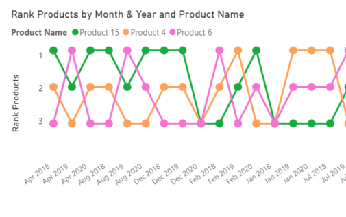
Overly complex charts can overwhelm users, making it harder to understand the data. When charts include too many details or intricate patterns, they can confuse rather than clarify.
To improve, keep charts simple and focus on key insights. Use basic visualizations like bar or line charts for clear comparisons and trends, ensuring the data is easy to digest and interpret quickly.
Mistake 8 : Poor layout and alignment of elements
Poor layout and alignment can make a dashboard look chaotic and unprofessional. When elements are not aligned properly, it can distract users from the data and cause confusion.
To improve, ensure a clean, organized layout with consistent spacing and alignment. Group related items together and follow visual hierarchy principles, which help users focus on the most important information first, leading to better comprehension and user experience.
Mistake 9 : Not testing for performance with large datasets
Not testing for performance with large datasets can result in slow loading times and poor user experience. Dashboards should be optimized to handle large amounts of data without compromising speed or responsiveness.
To avoid this, test dashboards with different data volumes, ensuring that they load quickly and perform well. Utilize techniques such as data aggregation, filtering, and incremental loading to improve performance and provide users with seamless interaction, even with large datasets.
Take a look at these prime Power BI use cases we've crafted for our industry CTOs. These BI examples helped them simplify their operational decisions!
Mistake 10 : Lack of context
Lack of context can confuse users and reduce the effectiveness of a dashboard. Without providing background information or explanations for the data, users may misinterpret the insights or fail to act on them correctly.
To avoid this, always provide clear labels, titles, and descriptions that explain the data, as well as any necessary context. This will help users understand the significance of the information presented and make more informed decisions.
Mistake 11 : Too many colours
Using too many colours on a dashboard can overwhelm users and distract from key information. When a dashboard has excessive colour variation, it becomes harder to focus on important data and may cause confusion.
To improve clarity, limit the colour palette to a few complementary shades. Use colour to highlight critical data points or trends, ensuring that it adds value without becoming a visual overload.
Mistake 12 : Too busy design
A busy design can overwhelm users and obscure key information. Too many elements on a dashboard can lead to clutter, making it difficult to identify what truly matters.
To improve clarity, limit the colour palette to a few complementary shades. Use colour to highlight critical data points or trends, ensuring that it adds value without becoming a visual overload.
Mistake 13 : Poor data-to-visualization pairing
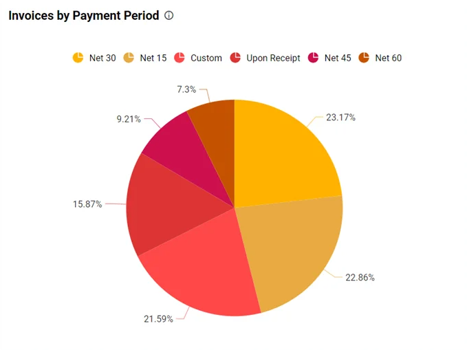
Poor data-to-visualization pairing happens when the chosen chart or graph doesn't effectively represent the underlying data. For example, using a pie chart for time series data or a bar chart for percentage values can confuse users.
It's important to match the right visualization type to the data to ensure clarity and understanding. Proper visualization helps users interpret the data accurately and quickly, making the dashboard more user-friendly and insightful.
Mistake 14 : Insufficiently labeled data
Insufficiently labeled data can create confusion, making it difficult for users to understand what the numbers or visual elements represent. Proper labelling ensures that each data point is clearly defined and its meaning is easily grasped. It’s essential to include titles, axes labels, and clear legends so users can interpret the data accurately.
Without proper labels, users may struggle to draw the right conclusions or make informed decisions from the dashboard.
Mistake 15 : No user consideration
No user consideration in dashboard design can lead to poor user experience. A dashboard should be tailored to the needs and expectations of its audience, considering factors like their role, skill level, and what they aim to achieve.
Without user consideration, the dashboard might present data in a way that is not useful or accessible, diminishing its value and effectiveness. Understanding the user's context is essential for creating dashboards that are both intuitive and relevant.
Mistake 16 : Too much white space and padding
Too much white space and padding in a dashboard design can make it look sparse and harder to focus on important data. While spacing is important for clarity, excessive space can lead to unnecessary scrolling and disrupt the flow of information.
Proper balance between white space and content ensures that the dashboard feels clean and well-organized without wasting valuable screen real estate. Effective use of padding can improve readability, but it’s essential to maintain a functional and cohesive layout.


