Let's rewind to the 1990s. Data used to be stored on servers and CEOs relied on basic tools to make optimal decisions. No dashboards, nothing.
When you use Power BI with a solid plan, it allows you to grasp how customers act, spot trends, improve business processes, and make smart decisions based on the data.
Fast forward to the 2000s, cloud servers like AWS, GCP, and Microsoft Azure caught the market by offering big data storage, scalability, and rapid performance. This is when business intelligence started gaining hype among industries and other executives.
BI services allow you to build dynamic dashboards specific to your role, let’s say CEO. With its real-time visuals and actionable insights, you can make informed decisions quickly while keeping every department in sync.
In this blog, we will explore various examples of CEO dashboards that help in finding weak spots and improving decisions.
Top CEO Dashboard Examples for Business Executives
Your business success and revenue depend on how well you make decisions. And this is where CEO dashboards enter to fuel this aspect. Given below are some of the best use cases of Executive dashboards which make decision-making a breeze.
Take a look at these prime Power BI use cases we've crafted for our industry CTOs. These BI examples helped them simplify their operational decisions!
HealthTech
LegalTech
FinTech
Healthcare CEO Dashboard
CEO dashboards for healthcare providers offer a thorough view of key performance indicators (KPIs) – critical for the right decisions.
These dashboards typically include:
Metrics on patient satisfaction,
Financial performance,
Operational efficiency, and
Clinical outcomes.
Because these BI dashboards are built using various technologies like Fabric, Looker, Tableau or Power BI, integrating healthcare data sources becomes seamless. This includes EHRs, patient feedback surveys, billing systems, etc.
Financial CEO dashboards offer a comprehensive view of key performance indicators (KPIs) – critical for making strategic decisions. These Business Intelligence dashboards typically include:
Metrics on transaction volumes,
Financial performance,
Customer acquisition and retention, and
Regulatory compliance.
Because these Financial data visualization dashboards are built using various platforms like Fabric, Tableau, Looker or Power BI, integrating fintech data sources becomes seamless. This includes transaction databases, customer feedback surveys, compliance systems, etc.
Here’s an example use case of CEO dashboard.
However, the problem is that as the financial business grows, so does the data. Devastatingly displaying too much data in a common CEO dashboard looks more and more complex. That’s why CEO dashboards are divided into various types as follows:
Revenue forecasting CEO dashboard provides actionable insights into revenue projections and budgeting performance which help you make optimal decisions.
Focus area: Financial planning and analysis.
Who looks at it? CFOs, financial planners.
How often - Monthly or quarterly.
Key metrics:
Revenue forecasts
Budget variances
Expenditure trends.
Data sources integrated: Financial software, and budgeting tools.
Examples: Accurate revenue forecasting, and effective budget management.
This operational dashboard provides insights into operational costs and optimization opportunities.
Focus area: Cost management and operational efficiency.
Who looks at it? Operations managers, financial analysts.
How often - Monthly or quarterly.
Key metrics:
Operational costs
Cost savings
Efficiency ratios.
Data sources integrated: ERP systems, and cost management tools.
Examples: Reducing operational costs, and improving efficiency.
Legal CEO Dashboards
CEO dashboards for legal firms offer a comprehensive view of key performance indicators (KPIs) – critical for making informed decisions. These dashboards typically include:
Metrics on case outcomes
Financial performance
Client satisfaction, and
Operational efficiency.
Because these BI dashboards are built using various technologies like Looker, Tableau, Microsoft Fabric or Power BI, integrating legal data sources becomes seamless. This includes case management systems, client feedback surveys, billing systems, etc.
However, the problem is that as the organization grows, so does the data. Overwhelmingly presenting too much detail in a common CEO dashboard becomes more complex. That’s why Legal Executive dashboards are divided into various types as follows:
14. Case Progress & Billable Hours Dashboard
This Executive dashboard helps legal consultants and CEOs find the progress of legal cases and billable hours.
Focus area: Case management and billing efficiency.
Who looks at it? Attorneys, case managers.
How often - Weekly or monthly.
Key metrics:
Case status
Billable hours
Time spent per case.
Data sources integrated: Case management systems, and time tracking tools.
Examples: Monitoring case progress, and optimizing billable hours.
This CEO dashboard plays a vital role in tracking litigation trends and settlements.
Focus area: Litigation management and trend analysis.
Who looks at it? Litigation managers, partners.
How often - Quarterly or as needed.
Key metrics:
Number of cases
Settlement amounts
Litigation outcomes.
Data sources integrated: Case management systems, and legal databases.
Examples: Analyzing litigation trends and optimizing settlement strategies.
So, all these are the Executive dashboard examples that help CEOs in optimal decision making be it for healthcare, fintech, legal, etc.
Our Power BI Templates
(Turning insights into various data visualizations)
Step Area Chart
Our Step Chart visualization built with Power BI provides a simple way to grasp complex time-related data, enabling faster, data-driven decision-making.
Why is it worth using?
Helps identify trends 40% more accurately.
Cuts analysis time by 25%.
Highly customizable.
Popular among over 250,000 professionals.
Speeds up data-driven decisions in Fortune 500 companies.
Pie Chart
This personalized pie chart brings data to life with labeled sections, vibrant colors, and interactive tooltips. Click on slices to explore details and filter insights effortlessly!
Why is it worth using?
Clear category representation.
Adaptable dynamic data.
Highly customizable.
Highlighting specific data points.
40% trend identification improvement.
25% analysis time reduction.
Bump Chart
Track ranking changes over time with our Bump Chart for Power BI. Gain clear insights into performance dynamics and compare entities effortlessly!
Why is it worth using?
Gain clarity on performance shifts over time.
Customized colors, and tooltips to fit your needs.
Ideal for data analysts, business leaders, and financial planners.
Make smarter decisions with trend insights.
Track rankings effortlessly for action.
CEO Dashboard Use Cases – Wrapping up
A great Executive dashboard is something that tells you exactly how your business is performing, whether it is for legal, healthtech, or fintech. These come in various types and that’s what we discussed in this article.
This article walked through 19 CEO dashboards each explaining in detail about their focus area, primary users, key metrics, data sources integrated and how often one can look into it. We hope you find this useful and helped you learn several things that you were not aware of before.
Want to build custom executive dashboards? Partner with iFour, a leading CEO dashboard development company, and get your needs done.
19 CEO Dashboard Examples for Business Leaders
Let's rewind to the 1990s. Data used to be stored on servers and CEOs relied on basic tools to make optimal decisions. No dashboards, nothing.
When you use Power BI with a solid plan, it allows you to grasp how customers act, spot trends, improve business processes, and make smart decisions based on the data.
Fast forward to the 2000s, cloud servers like AWS, GCP, and Microsoft Azure caught the market by offering big data storage, scalability, and rapid performance. This is when business intelligence started gaining hype among industries and other executives.
BI services allow you to build dynamic dashboards specific to your role, let’s say CEO. With its real-time visuals and actionable insights, you can make informed decisions quickly while keeping every department in sync.
In this blog, we will explore various examples of CEO dashboards that help in finding weak spots and improving decisions.
Top CEO Dashboard Examples for Business Executives
Your business success and revenue depend on how well you make decisions. And this is where CEO dashboards enter to fuel this aspect. Given below are some of the best use cases of Executive dashboards which make decision-making a breeze.
Take a look at these prime Power BI use cases we've crafted for our industry CTOs. These BI examples helped them simplify their operational decisions!
HealthTech
View Demo
Custom
LegalTech
View Demo
Custom
FinTech
View Demo
Custom
Healthcare CEO Dashboard
CEO dashboards for healthcare providers offer a thorough view of key performance indicators (KPIs) – critical for the right decisions.
These dashboards typically include:
Metrics on patient satisfaction,
Financial performance,
Operational efficiency, and
Clinical outcomes.
Because these BI dashboards are built using various technologies like Fabric, Looker, Tableau or Power BI, integrating healthcare data sources becomes seamless. This includes EHRs, patient feedback surveys, billing systems, etc.
Hire Power BI developers to create your custom CEO dashboards
Get in touch
Let’s look at the examples or use cases of CEO dashboards:
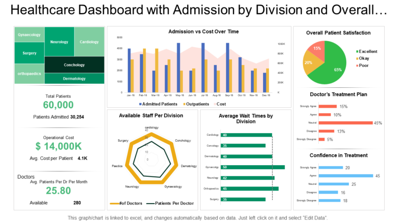
1. Patient Analytics & Operational Efficiency Dashboard
This Healthcare CEO dashboard offers insights into patient demographics, treatment outcomes, and operational efficiency.
Focus area: Patient care and hospital operations.
Who looks at it? Hospital administrators and department heads.
How often - Monthly or quarterly.
Key metrics:
Revenue
Expenses
Accounts receivable
Claim denial rates.
Data sources integrated: Electronic Health Records (EHR), and patient management systems.
Examples: Reducing patient wait times, and optimizing bed usage.
Image source
2. Hospital Financial Performance & Revenue Cycle Dashboard
With this CEO dashboard, you dig deeper and track the financial health and revenue cycle performance of the hospital.
Focus area: Financial management and revenue optimization.
Who looks at it? CFOs, financial analysts, and billing departments.
How often - Daily or weekly.
Key metrics:
Patient wait times,
Bed occupancy rates,
Treatment success rates.
Data sources integrated: Financial software, billing systems.
Examples: Improving cash flow, reducing claim denials.
Read More: HR Analytics Dashboard – Key Metrics & Examples
3. Healthcare Compliance & Risk Management Dashboard
This is yet another CEO dashboard for healthcare that helps you monitor compliance with healthcare regulations and learn potential risks.
Focus area: Regulatory compliance and risk management.
Who looks at it? Compliance officers, risk managers.
How often - Monthly or as needed.
Key metrics:
Compliance rates
Incident reports
Audit results.
Data sources integrated: Compliance management systems and incident reporting tools.
Examples: Ensuring regulatory compliance, and mitigating risks.
4. Medical Staff Performance & Resource Utilization Dashboard
Evaluates the performance of medical staff and resource utilization.
Focus area: Staff performance and resource management.
Who looks at it? HR managers, department heads.
How often - Monthly or quarterly.
Key metrics:
Staff productivity
Resource utilization rates
Overtime hours.
Data sources integrated: HR systems, resource management tools.
Examples Enhancing staff productivity, and optimizing resource allocation.
Get your workflows automated seamlessly with Power Automate consulting services
Avail services now
Meanwhile, check out how to use healthcare analytics – best tips given by expert.
5. Patient Satisfaction & Experience Dashboard
With this healthcare executive dashboard, you can measure patient satisfaction and overall experience.
Focus area: Patient feedback and service quality.
Who looks at it? Patient experience managers, quality assurance teams.
How often - Monthly or quarterly.
Key metrics:
Patient satisfaction scores
Feedback trends, and
Service quality indicators.
Data sources integrated: Patient feedback surveys, and service quality assessment tools.
Examples: Improving patient satisfaction, and enhancing service quality.
Image source
6. Telemedicine & Remote Care Performance Dashboard
This CEO dashboard is often used by Physiotherapists to track the performance of telemedicine and remote care services.
Read More: 16 Power BI Dashboard Design Mistakes to Avoid
Focus area: Telehealth services and remote patient monitoring.
Who looks at it? Telehealth coordinators, remote care managers.
How often - Weekly or monthly.
Key metrics:
Number of telemedicine visits
Patient outcomes
Technology usage rates.
Data sources integrated: Telehealth platforms, remote monitoring systems.
Examples: Expanding telemedicine services, and improving remote care outcomes.
Move your data analytics effectively with Power BI Migration services
Let’s discuss now
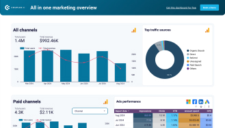
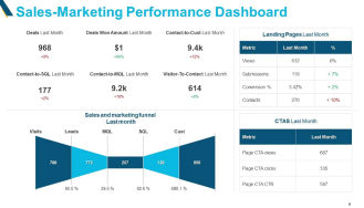
Fintech CEO Dashboards
Financial CEO dashboards offer a comprehensive view of key performance indicators (KPIs) – critical for making strategic decisions. These Business Intelligence dashboards typically include:
Metrics on transaction volumes,
Financial performance,
Customer acquisition and retention, and
Regulatory compliance.
Because these Financial data visualization dashboards are built using various platforms like Fabric, Tableau, Looker or Power BI, integrating fintech data sources becomes seamless. This includes transaction databases, customer feedback surveys, compliance systems, etc.
Here’s an example use case of CEO dashboard.
However, the problem is that as the financial business grows, so does the data. Devastatingly displaying too much data in a common CEO dashboard looks more and more complex. That’s why CEO dashboards are divided into various types as follows:
Read More: 10 Executive Dashboard Examples for Consultants and CEOs
7. Fintech Risk & Compliance Monitoring Dashboard
Fintech Risk assessment dashboard you can check and monitor risk and compliance metrics specific to fintech operations.
Focus area: Risk management and regulatory compliance.
Who looks at it? Compliance officers, risk managers.
How often - Daily or weekly.
Key metrics:
Risk exposure
Compliance status
Incident reports.
Data sources integrated: Risk management systems and compliance databases.
Examples: Identifying potential risks, and ensuring regulatory adherence
Drive innovation through Power Platform consulting services
Hire us now
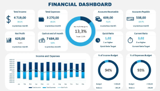
8. Revenue Forecasting & Budgeting Dashboard
Revenue forecasting CEO dashboard provides actionable insights into revenue projections and budgeting performance which help you make optimal decisions.
Focus area: Financial planning and analysis.
Who looks at it? CFOs, financial planners.
How often - Monthly or quarterly.
Key metrics:
Revenue forecasts
Budget variances
Expenditure trends.
Data sources integrated: Financial software, and budgeting tools.
Examples: Accurate revenue forecasting, and effective budget management.
Image source
9. Customer Acquisition & Retention Dashboard
With this customer acquisition executive dashboard, you can track KPIs related to acquiring and retaining customers.
Focus area: Marketing and customer relationship management.
Who looks at it? Marketing managers, customer success teams.
How often - Weekly or monthly.
Key metrics:
Customer acquisition cost
Retention rates
Churn rates.
Data sources integrated: CRM systems, marketing analytics tools.
Examples: Improving customer acquisition strategies, enhancing retention efforts.
Read More: How to Export Power BI Data to Excel
10. Investment & Portfolio Performance Dashboard
This executive dashboard evaluates the performance of investments and portfolios, helping CEOs make informed financial decisions.
Focus area: Investment management and portfolio analysis.
Who looks at it? Portfolio managers, and financial analysts.
How often - Monthly or quarterly.
Key metrics:
ROI
Portfolio growth
Asset allocation.
Data sources integrated: Investment management software, financial databases.
Examples Optimizing investment strategies, tracking portfolio performance.
Build your apps in no time with a Low code app development services
Contact now
11. Fraud Detection & Cybersecurity Insights Dashboard
This CEO dashboard assists you in monitoring fraud detection and cybersecurity metrics of your enterprise.
Focus area: Security and fraud prevention.
Who looks at it? Security analysts, IT managers.
How often - Daily or as needed.
Key metrics:
Fraud incidents
Security breaches
Threat levels.
Data sources integrated: Security information and event management (SIEM) systems, and fraud detection tools.
Examples: Detecting fraudulent activities, and enhancing cybersecurity measures.
Image source
12. Regulatory Compliance & Audit Dashboard
This CEO dashboard enables you to track compliance with regulations and audit results.
Focus area: Regulatory compliance and audit management.
Who looks at it? Compliance officers, auditors.
How often - Quarterly or as needed.
Key metrics:
Compliance rates
Audit findings
Corrective actions.
Data sources integrated: Compliance management systems, and audit tools.
Examples: Ensuring regulatory compliance, and addressing audit findings.
Read More: 8 Powerful Data Storytelling Examples for CTOs
13. Operational Cost Optimization Dashboard
This operational dashboard provides insights into operational costs and optimization opportunities.
Focus area: Cost management and operational efficiency.
Who looks at it? Operations managers, financial analysts.
How often - Monthly or quarterly.
Key metrics:
Operational costs
Cost savings
Efficiency ratios.
Data sources integrated: ERP systems, and cost management tools.
Examples: Reducing operational costs, and improving efficiency.
Legal CEO Dashboards
CEO dashboards for legal firms offer a comprehensive view of key performance indicators (KPIs) – critical for making informed decisions. These dashboards typically include:
Metrics on case outcomes
Financial performance
Client satisfaction, and
Operational efficiency.
Because these BI dashboards are built using various technologies like Looker, Tableau, Microsoft Fabric or Power BI, integrating legal data sources becomes seamless. This includes case management systems, client feedback surveys, billing systems, etc.
However, the problem is that as the organization grows, so does the data. Overwhelmingly presenting too much detail in a common CEO dashboard becomes more complex. That’s why Legal Executive dashboards are divided into various types as follows:
14. Case Progress & Billable Hours Dashboard
This Executive dashboard helps legal consultants and CEOs find the progress of legal cases and billable hours.
Focus area: Case management and billing efficiency.
Who looks at it? Attorneys, case managers.
How often - Weekly or monthly.
Key metrics:
Case status
Billable hours
Time spent per case.
Data sources integrated: Case management systems, and time tracking tools.
Examples: Monitoring case progress, and optimizing billable hours.
Image source
15. Law Firm Financial Performance Dashboard
This litigation dashboard provides insights into the financial health of the law firm.
Focus area: Financial management and performance analysis.
Who looks at it? Partners, financial analysts.
How often - Monthly or quarterly.
Key metrics:
Revenue
Expenses
Profit margins.
Data sources integrated: Financial software and accounting systems.
Examples: Improving financial performance, and managing expenses.
16. Client Retention & Satisfaction Dashboard – Law firm
This dashboard helps executives in measuring client retention rates and satisfaction levels.
Focus area: Client relationship management.
Who looks at it? Client relationship managers, partners.
How often - - Monthly or quarterly.
Key metrics:
Retention rates
Client satisfaction scores
Feedback trends.
Data sources integrated: CRM systems, and client feedback tools.
Examples: Enhancing client satisfaction, and improving retention strategies.
Check out this video that clearly explains the Legal executive dashboard and its key performance indicators.
17. Regulatory & Compliance Risk Dashboard for Law firm
With this executive dashboard, you can monitor compliance followed by legal regulations and identify risks.
Focus area: Regulatory compliance and risk management.
Who looks at it? Compliance officers, risk managers.
How often - Monthly or as needed.
Key metrics:
Compliance rates
Risk assessments
Incident reports.
Data sources integrated: Compliance management systems and risk assessment tools.
Examples Ensuring regulatory compliance, and mitigating risks.
18. Workforce Productivity & Attorney Performance Dashboard
This performance dashboard for legal executives evaluates the work productivity and performance of attorneys.
Focus area: Workforce management and performance analysis.
Who looks at it? HR managers, partners.
How often - Monthly or quarterly.
Key metrics:
Productivity rates
Performance scores
Utilization rates.
Data sources integrated: HR systems and performance management tools.
Examples: Enhancing attorney productivity, and improving performance metrics.
Image source
19. Litigation & Settlement Trends Dashboard
This CEO dashboard plays a vital role in tracking litigation trends and settlements.
Focus area: Litigation management and trend analysis.
Who looks at it? Litigation managers, partners.
How often - Quarterly or as needed.
Key metrics:
Number of cases
Settlement amounts
Litigation outcomes.
Data sources integrated: Case management systems, and legal databases.
Examples: Analyzing litigation trends and optimizing settlement strategies.
So, all these are the Executive dashboard examples that help CEOs in optimal decision making be it for healthcare, fintech, legal, etc.
Our Power BI Templates
(Turning insights into various data visualizations)
Step Area Chart
Our Step Chart visualization built with Power BI provides a simple way to grasp complex time-related data, enabling faster, data-driven decision-making.
Why is it worth using?
Helps identify trends 40% more accurately.
Cuts analysis time by 25%.
Highly customizable.
Popular among over 250,000 professionals.
Speeds up data-driven decisions in Fortune 500 companies.
View Live Demo
Pie Chart
This personalized pie chart brings data to life with labeled sections, vibrant colors, and interactive tooltips. Click on slices to explore details and filter insights effortlessly!
Why is it worth using?
Clear category representation.
Adaptable dynamic data.
Highly customizable.
Highlighting specific data points.
40% trend identification improvement.
25% analysis time reduction.
View Live Demo
Bump Chart
Track ranking changes over time with our Bump Chart for Power BI. Gain clear insights into performance dynamics and compare entities effortlessly!
Why is it worth using?
Gain clarity on performance shifts over time.
Customized colors, and tooltips to fit your needs.
Ideal for data analysts, business leaders, and financial planners.
Make smarter decisions with trend insights.
Track rankings effortlessly for action.
View Live Demo
CEO Dashboard Use Cases – Wrapping up
A great Executive dashboard is something that tells you exactly how your business is performing, whether it is for legal, healthtech, or fintech. These come in various types and that’s what we discussed in this article.
This article walked through 19 CEO dashboards each explaining in detail about their focus area, primary users, key metrics, data sources integrated and how often one can look into it. We hope you find this useful and helped you learn several things that you were not aware of before.
Want to build custom executive dashboards? Partner with iFour, a leading CEO dashboard development company, and get your needs done.
Kapil Panchal
A passionate Technical writer and an SEO freak working as a Content Development Manager at iFour Technolab, USA. With extensive experience in IT, Services, and Product sectors, I relish writing about technology and love sharing exceptional insights on various platforms. I believe in constant learning and am passionate about being better every day.
Selecting the right project management software helps you complete tasks on time with accuracy. Whether your team has five people or five hundred, choosing the right solution is essential...
AI agents are everywhere these days.
The world's biggest tech players - Microsoft, Alphabet, Amazon, and Meta are investing heavily in AI infrastructure, with spending expected...
You already know how healthcare creates tons of clinical data every day. Patient visits… Labs… EMRs… doctor portals… scheduling systems… everything is generating numbers nonstop.
But...


