×

iFour Logo

Getting Started with Angular Animations

Kapil Panchal - January 22, 2021

Listening is fun too.

Straighten your back and cherish with coffee - PLAY !

  • play
  • pause
  • pause
Getting Started with Angular Animations

Animation offers the illusion of motion: HTML elements change the styling through time. Well, designed animations can make your application more fun and easier to use, but they are not just decorative. Animations can improve your app with user experience in several methods:


Table of Content

 
  • Without animations, web page transitions can appear sudden and jarring.
  • Motion significantly increases the user experience, so animations allow users to detect the application's response to their actions.
  • Well, animations automatically call the user's attention to where it is required.

Getting Started


The @angular/animations and @angular/platform-browser are the main Angular modules for animations. When you create a new project through the angular CLI, these dependencies are automatically or systematically added to your project.

To get started with adding Angular animations to your project, import the animation specific modules beside standard Angular functionality.

Step 1: Enabling the animations module

To introduce the animation capabilities into your angular root application module, import the BrowserAnimationModule.

App.module.ts
                          import { BrowserModule } from '@angular/platform-browser';
                          import { NgModule } from '@angular/core';
                          import { AppRoutingModule } from './app-routing.module'
                          import { AppComponent } from './app.component';
                          import { BrowserAnimationsModule } from '@angular/platform-browser/animations';
                          @NgModule({
                          declarations: [
                          AppComponent
                          ],
                          imports: [
                          BrowserModule,
                          AppRoutingModule,
                          BrowserAnimationsModule
                          ],
                          providers: [],
                          bootstrap: [AppComponent]
                          })
                          export class AppModule { }
                      

Step 2: Importing functions of animation into component files

If you want to use particular animation functions in component files, import those functions from @angular/animations.

App.component.ts
                        import { Component } from '@angular/core';
                        import {
                          animate,
                          state,
                          style,
                          trigger,
                          transition,
                          // ...
                        } from '@angular/animations';
                      

Step 3: Adding the Metadata property of the animation

Add a metadata property called animations: within the @component () decorator of the component file. You put the triggers that specify an animation within the animations metadata property.

App.component.ts
                        @Component({
                          selector: 'app-root',
                          templateUrl: './app.component.html',
                          styleUrls: ['./app.component.css'],
                          animations:[
                            //animation triggers place here
                          ]
                        })
                      

Animating a simple transition


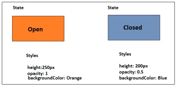
Let us animate a simple transition that modifies a single HTML element from one state to another. For example, you can define that a button displays moreover Open or Closed depend on the last action of the user. The button is visible and orange when the button is in the open state. It becomes transparent and blue when it's the closed state.

In HTML, these attributes are set through ordinary CSS styles like color and opacity. Angular uses the style () function to determine a set of CSS styles for use with animations. You can take a set of styles in an animation state, and give the state a name, like open or closed.

Trigger-in-Xamarin

Figure 1: Using style () function with Animations

Animation State and Styles


To define several states to call, use Angular’s state () function at the end of each transition. This function takes two arguments which are having a unique name like open or closed and a style () function

To define a set of associates with a given state name use the style () function. Note that the style attribute should be in camelCase.

Open-and-close.component.ts
                  state('open', style({
                    height: '250px',
                        opacity: 1,
                        backgroundColor: 'orange'
                    }))
                

Following is the closed state, the button has a height of 200 pixels, an opacity of 0.5 and a background color of blue:

state('closed', style({
                  height: '200px',
                      opacity: 0.5,
                  backgroundColor: 'blue'
                  }))

Transition and timing


We can set multiple styles without any animation in Angular. Despite that, without further refinement, the button immediately transforms with no fade, no contraction, or other visible indicators that a change is occurring.

To make the change less sudden, we require to determine an animation transition to specify the changes that occur between one state and another above a time. The transition () function takes two arguments in which, the first argument takes an expression that determines the direction between two transition states and the second argument takes on or a sequence of animate () steps.

Use the animate () function to determine the length, delay, and easing of transition and to appoint the style function for determining styles when transitions are occurring. You can also use the animate () function to specify the keyframes () function for multi-step animations. These definitions are located in the second argument of the animate () function.

Animation metadata: duration, delay, and easing


The animate () function or second argument of the transition function assumes the timings and styles input parameters.

The timings parameter accepts a string specified in three parts.

Animate (‘duration delay easing’)

In the first part, the duration is needed. The duration can be stated in milliseconds as a simple number without quotes or in seconds with quotes and time identifier. For example, a duration of a second can be stated as follows:

  • For a plain number in milliseconds: 100
  • In a string format for milliseconds: ‘100ms’
  • In a string format for a second: '0.1s'

The second argument, delay, has the same syntax for the duration like in example:

  • Expect for 100ms and then run for 200ms: ‘0.2s 100ms’

The third argument is easing, which controls how the animation accelerates and decelerates within its runtime. For example, ease-in creates the animation to start slowly, and to pick up speedway it progresses.

  • Wait for 100ms, run for 200ms. Use a deceleration curve to begin out fast and slowly decelerate to a resting point: ‘0.2s 100ms ease-out’.
  • Start instantly, run for 200ms. Use an acceleration curve to begin slow and end at the full velocity: '0.2s ease-in'.

The following example offers a state transition from open to closed over a one-second transition between states.

Open-and-close.component.ts
transition ('open => closed', [
                  animate('1s')
                  ]),

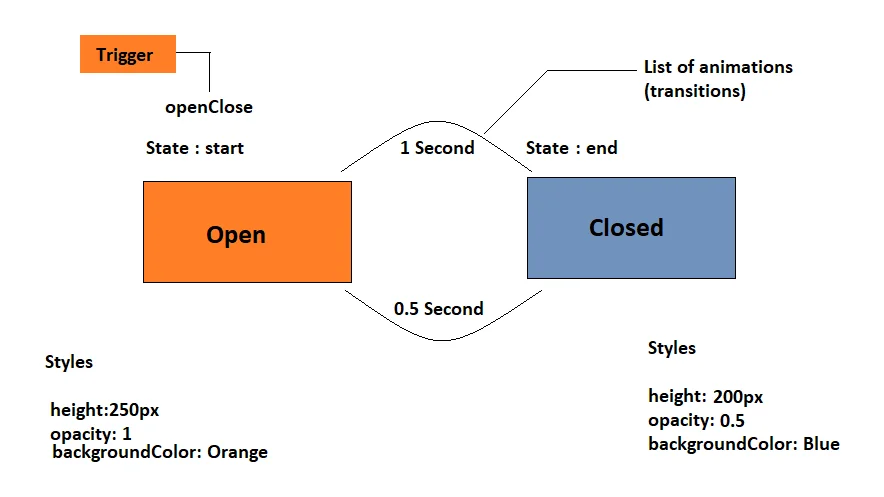
In the code snippet above, the => operator shows unidirectional transitions and <=> is bidirectional. Inside the transition, animate () specifies how long the transition requires. In this case, the state change from open to closed takes one second, states here as 1s.

This example adds a state transition from the closed state to the open state over a 0.5-second transition animation arc.

Open-and-close.component.ts
                        transition('closed => open', [
                        animate('0.5s')
                        ]),
                    

Looking to Hire Angular Developer?
Your Search ends here.

Triggering the animation


An animation needs a trigger so that it known when to start. The trigger () function takes the states and transitions and provides the animation a name so that you can attach it to the triggering element in the HTML template.

The trigger () function explains the property name to watch for changes. The trigger initiates the actions included in its definition when a change occurs.

In the following example we will name the trigger openClose and attach it to the button element. The trigger explains the open and closed states and the two transitions timings

Trigger-in-Xamarin

Figure 2: Open and Closed states with two transitions timing

Establishing animations and attaching them to the HTML template


Animations are determined in the metadata of the component that controls the HTML element to be animated. Put the code that defines your animations under the animations: property within the @component () decorator.

Open-and-close.component.ts
                  import { animate, state, style, transition, trigger } from '@angular/animations';
                        import { Component } from '@angular/core';
                        @Component({
                          selector: 'app-open-and-close',
                          animations: [
                            trigger('openClose', [
                              // ...
                              state('open', style({
                                height: '250px',
                                opacity: 1,
                                backgroundColor: 'orange'
                              })),
                              state('closed', style({
                                height: '200px',
                                opacity: 0.5,
                                backgroundColor: 'blue'
                              })),
                              transition('open => closed', [
                                animate('1s')
                              ]),
                              transition('closed => open', [
                                animate('0.5s')
                              ]),
                            ]),
                          ],
                          templateUrl: './open-and-close.component.html',
                          styleUrls: ['./open-and-close.component.css']
                        })
                        export class OpenAndCloseComponent {
                          isOpen = true;
                          toggle() {
                            this.isOpen = !this.isOpen;
                          }
                        }
                

When you have determined an animation trigger for a component you can attach it to an element in that component's template by wrapping the trigger name in brackets and preceding it with an @symbol. Then you can bind the trigger to a template expression through standard Angular property binding syntax as the following, where triggerName is the name of trigger and expression assesses to a defined animation state.


...

The animation is executed or triggered once the expression value modifies to a new state.

The animation is executed or triggered once the expression value modifies to a new state.

The following code binds the trigger to the value of the isOpen property.

Open-and-close.component.html


Now the box is {{isOpen?'Open':'Closed'}}!

Open-and-close.component.css
:host {
                  display: block;
                }
                
                .open-and-close-container {
                  border: 2px solid #dddddd;
                  margin-top: 2em;
                  padding: 30px 30px 0px 30px;
                  color: green;
                  font-weight: bold;
                  font-size: 22px;
                }
Output
Trigger-in-Xamarin

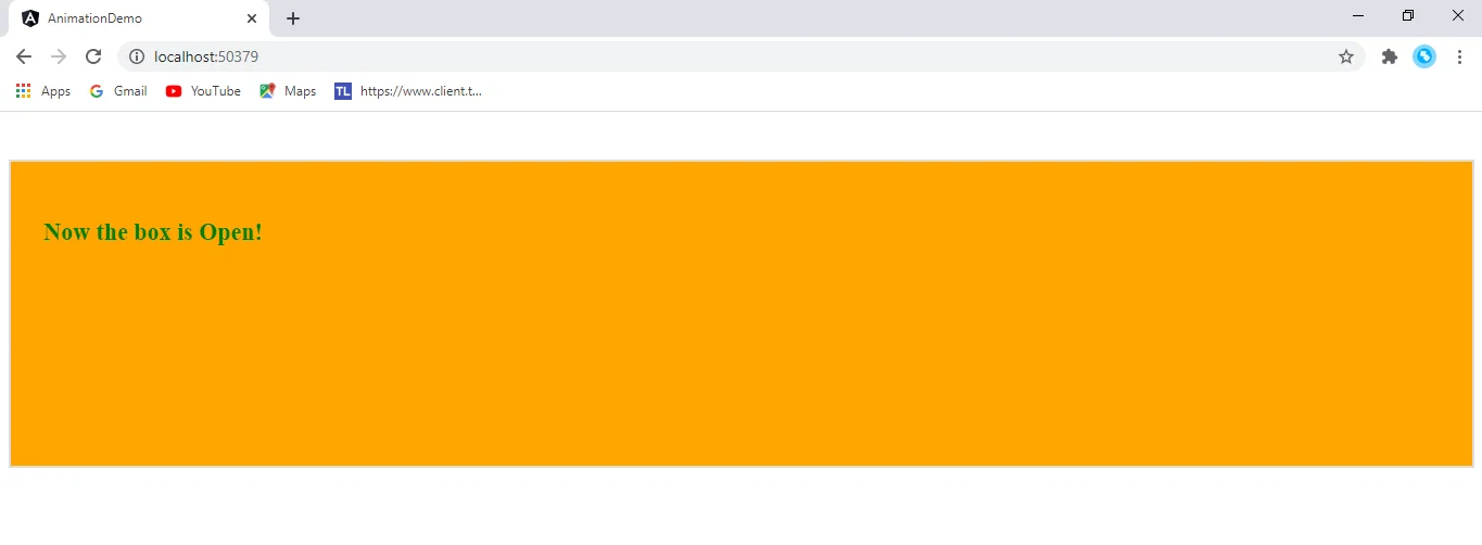
Figure 3: Output of the above example code snippet

In the above example when the isOpen expression evaluates to a defined state of open or closed, it notifies the trigger openClose of a state change. Then it is up to the openClose code to handle the state change and start a state change animation.

For elements opening or leaving a page, you can make the animations conditional, For example, use *ngIf with the animation trigger in the HTML template.

Conclusion


In this blog, we have discussed animation in angular. We have discussed step by step implementation of it by enabling the angular animations module and importing animation functions into component files. Also, we have discussed animating a simple transition, animation state and styles, transitions and timing, and triggering the animation.

Getting Started with Angular Animations Animation offers the illusion of motion: HTML elements change the styling through time. Well, designed animations can make your application more fun and easier to use, but they are not just decorative. Animations can improve your app with user experience in several methods:   Table of Content 1. Getting Started 1.1 Step 1: Enabling the animations module 1.2 Step 2: Importing functions of animation into component files 1.3 Step 3: Adding the Metadata property of the animation 2. Animating a simple transition 3. Animation State and Styles 4. Transition and timing 5. Animation metadata: duration, delay, and easing 6. Triggering the animation 7. Establishing animations and attaching them to the HTML template 8. Conclusion   Without animations, web page transitions can appear sudden and jarring. Motion significantly increases the user experience, so animations allow users to detect the application's response to their actions. Well, animations automatically call the user's attention to where it is required. Getting Started The @angular/animations and @angular/platform-browser are the main Angular modules for animations. When you create a new project through the angular CLI, these dependencies are automatically or systematically added to your project. To get started with adding Angular animations to your project, import the animation specific modules beside standard Angular functionality. Step 1: Enabling the animations module To introduce the animation capabilities into your angular root application module, import the BrowserAnimationModule. App.module.ts import { BrowserModule } from '@angular/platform-browser'; import { NgModule } from '@angular/core'; import { AppRoutingModule } from './app-routing.module' import { AppComponent } from './app.component'; import { BrowserAnimationsModule } from '@angular/platform-browser/animations'; @NgModule({ declarations: [ AppComponent ], imports: [ BrowserModule, AppRoutingModule, BrowserAnimationsModule ], providers: [], bootstrap: [AppComponent] }) export class AppModule { } Step 2: Importing functions of animation into component files If you want to use particular animation functions in component files, import those functions from @angular/animations. App.component.ts import { Component } from '@angular/core'; import { animate, state, style, trigger, transition, // ... } from '@angular/animations'; Step 3: Adding the Metadata property of the animation Add a metadata property called animations: within the @component () decorator of the component file. You put the triggers that specify an animation within the animations metadata property. App.component.ts @Component({ selector: 'app-root', templateUrl: './app.component.html', styleUrls: ['./app.component.css'], animations:[ //animation triggers place here ] }) Read More: Ngstyle In Angular For Dynamic Styling Animating a simple transition Let us animate a simple transition that modifies a single HTML element from one state to another. For example, you can define that a button displays moreover Open or Closed depend on the last action of the user. The button is visible and orange when the button is in the open state. It becomes transparent and blue when it's the closed state. In HTML, these attributes are set through ordinary CSS styles like color and opacity. Angular uses the style () function to determine a set of CSS styles for use with animations. You can take a set of styles in an animation state, and give the state a name, like open or closed. Figure 1: Using style () function with Animations Animation State and Styles To define several states to call, use Angular’s state () function at the end of each transition. This function takes two arguments which are having a unique name like open or closed and a style () function To define a set of associates with a given state name use the style () function. Note that the style attribute should be in camelCase. Open-and-close.component.ts state('open', style({ height: '250px', opacity: 1, backgroundColor: 'orange' })) Following is the closed state, the button has a height of 200 pixels, an opacity of 0.5 and a background color of blue: state('closed', style({ height: '200px', opacity: 0.5, backgroundColor: 'blue' })) Transition and timing We can set multiple styles without any animation in Angular. Despite that, without further refinement, the button immediately transforms with no fade, no contraction, or other visible indicators that a change is occurring. To make the change less sudden, we require to determine an animation transition to specify the changes that occur between one state and another above a time. The transition () function takes two arguments in which, the first argument takes an expression that determines the direction between two transition states and the second argument takes on or a sequence of animate () steps. Use the animate () function to determine the length, delay, and easing of transition and to appoint the style function for determining styles when transitions are occurring. You can also use the animate () function to specify the keyframes () function for multi-step animations. These definitions are located in the second argument of the animate () function. Animation metadata: duration, delay, and easing The animate () function or second argument of the transition function assumes the timings and styles input parameters. The timings parameter accepts a string specified in three parts. Animate (‘duration delay easing’) In the first part, the duration is needed. The duration can be stated in milliseconds as a simple number without quotes or in seconds with quotes and time identifier. For example, a duration of a second can be stated as follows: For a plain number in milliseconds: 100 In a string format for milliseconds: ‘100ms’ In a string format for a second: '0.1s' The second argument, delay, has the same syntax for the duration like in example: Expect for 100ms and then run for 200ms: ‘0.2s 100ms’ The third argument is easing, which controls how the animation accelerates and decelerates within its runtime. For example, ease-in creates the animation to start slowly, and to pick up speedway it progresses. Wait for 100ms, run for 200ms. Use a deceleration curve to begin out fast and slowly decelerate to a resting point: ‘0.2s 100ms ease-out’. Start instantly, run for 200ms. Use an acceleration curve to begin slow and end at the full velocity: '0.2s ease-in'. The following example offers a state transition from open to closed over a one-second transition between states. Open-and-close.component.ts transition ('open => closed', [ animate('1s') ]), In the code snippet above, the => operator shows unidirectional transitions and is bidirectional. Inside the transition, animate () specifies how long the transition requires. In this case, the state change from open to closed takes one second, states here as 1s. This example adds a state transition from the closed state to the open state over a 0.5-second transition animation arc. Open-and-close.component.ts transition('closed => open', [ animate('0.5s') ]), Looking to Hire Angular Developer? Your Search ends here. See here Triggering the animation An animation needs a trigger so that it known when to start. The trigger () function takes the states and transitions and provides the animation a name so that you can attach it to the triggering element in the HTML template. The trigger () function explains the property name to watch for changes. The trigger initiates the actions included in its definition when a change occurs. In the following example we will name the trigger openClose and attach it to the button element. The trigger explains the open and closed states and the two transitions timings Figure 2: Open and Closed states with two transitions timing Establishing animations and attaching them to the HTML template Animations are determined in the metadata of the component that controls the HTML element to be animated. Put the code that defines your animations under the animations: property within the @component () decorator. Open-and-close.component.ts import { animate, state, style, transition, trigger } from '@angular/animations'; import { Component } from '@angular/core'; @Component({ selector: 'app-open-and-close', animations: [ trigger('openClose', [ // ... state('open', style({ height: '250px', opacity: 1, backgroundColor: 'orange' })), state('closed', style({ height: '200px', opacity: 0.5, backgroundColor: 'blue' })), transition('open => closed', [ animate('1s') ]), transition('closed => open', [ animate('0.5s') ]), ]), ], templateUrl: './open-and-close.component.html', styleUrls: ['./open-and-close.component.css'] }) export class OpenAndCloseComponent { isOpen = true; toggle() { this.isOpen = !this.isOpen; } } When you have determined an animation trigger for a component you can attach it to an element in that component's template by wrapping the trigger name in brackets and preceding it with an @symbol. Then you can bind the trigger to a template expression through standard Angular property binding syntax as the following, where triggerName is the name of trigger and expression assesses to a defined animation state.   ... The animation is executed or triggered once the expression value modifies to a new state. The animation is executed or triggered once the expression value modifies to a new state. The following code binds the trigger to the value of the isOpen property. Open-and-close.component.html   Now the box is {{isOpen?'Open':'Closed'}}! Open-and-close.component.css :host { display: block; } .open-and-close-container { border: 2px solid #dddddd; margin-top: 2em; padding: 30px 30px 0px 30px; color: green; font-weight: bold; font-size: 22px; } Output Figure 3: Output of the above example code snippet In the above example when the isOpen expression evaluates to a defined state of open or closed, it notifies the trigger openClose of a state change. Then it is up to the openClose code to handle the state change and start a state change animation. For elements opening or leaving a page, you can make the animations conditional, For example, use *ngIf with the animation trigger in the HTML template. Conclusion In this blog, we have discussed animation in angular. We have discussed step by step implementation of it by enabling the angular animations module and importing animation functions into component files. Also, we have discussed animating a simple transition, animation state and styles, transitions and timing, and triggering the animation.

Build Your Agile Team

Enter your e-mail address Please enter valid e-mail

Categories

Ensure your sustainable growth with our team

Talk to our experts
Sustainable
Sustainable
 

Blog Our insights

Power Apps vs Power Automate: When to Use What?

I often see people asking questions like “Is Power App the same as Power Automate?”. “Are they interchangeable or have their own purpose?”. We first need to clear up this confusion...

Azure DevOps Pipeline Deployment for Competitive Business: The Winning Formula

We always hear about how important it is to be competitive and stand out in the market. But as an entrepreneur, how would you truly set your business apart? Is there any way to do...

React 18 Vs React 19: Key Differences To Know For 2024

Ever wondered how a simple technology can spark a revolution in the IT business? Just look at React.js - a leading Front-end JS library released in 2013, has made it possible. Praised for its seamless features, React.js has altered the way of bespoke app development with its latest versions released periodically. React.js is known for building interactive user interfaces and has been evolving rapidly to meet the demands of modern web development. Thus, businesses lean to hire dedicated React.js developers for their projects. React.js 19 is the latest version released and people are loving its amazing features impelling them for its adoption.