


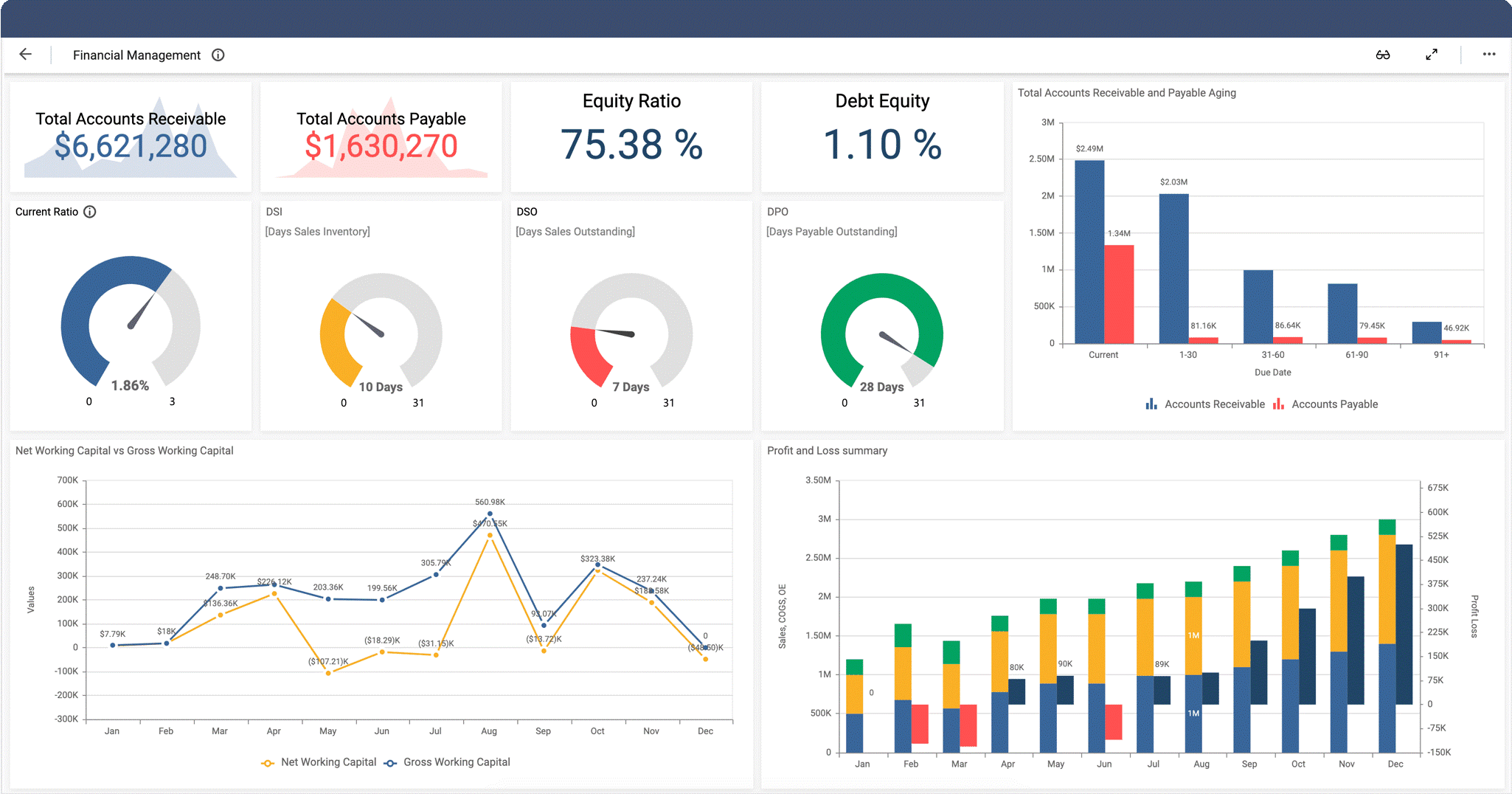
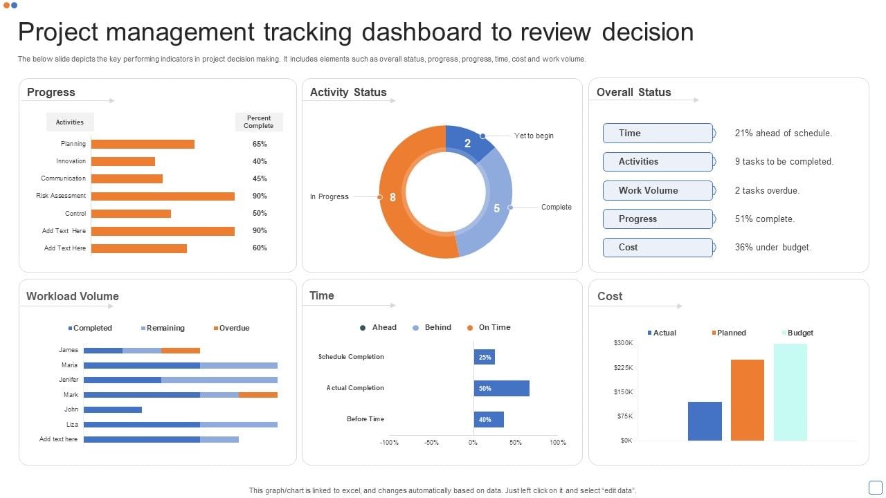
How to Do Forecasting in Power BI (Steps & Accuracy Metrics)
Remember our last guide - Power BI forecasting? It revealed things that truly blocks accuracy, both structural and situational. Now it's time to take the next step. Knowing Power...

601 & 612, The Times square Arcade, Near Baghban party plot, Thaltej - Shilaj Road, Thaltej, Ahmedabad, Gujarat - 380059
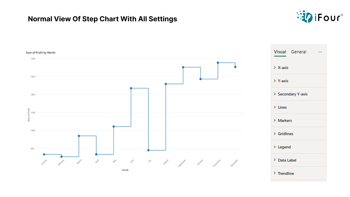

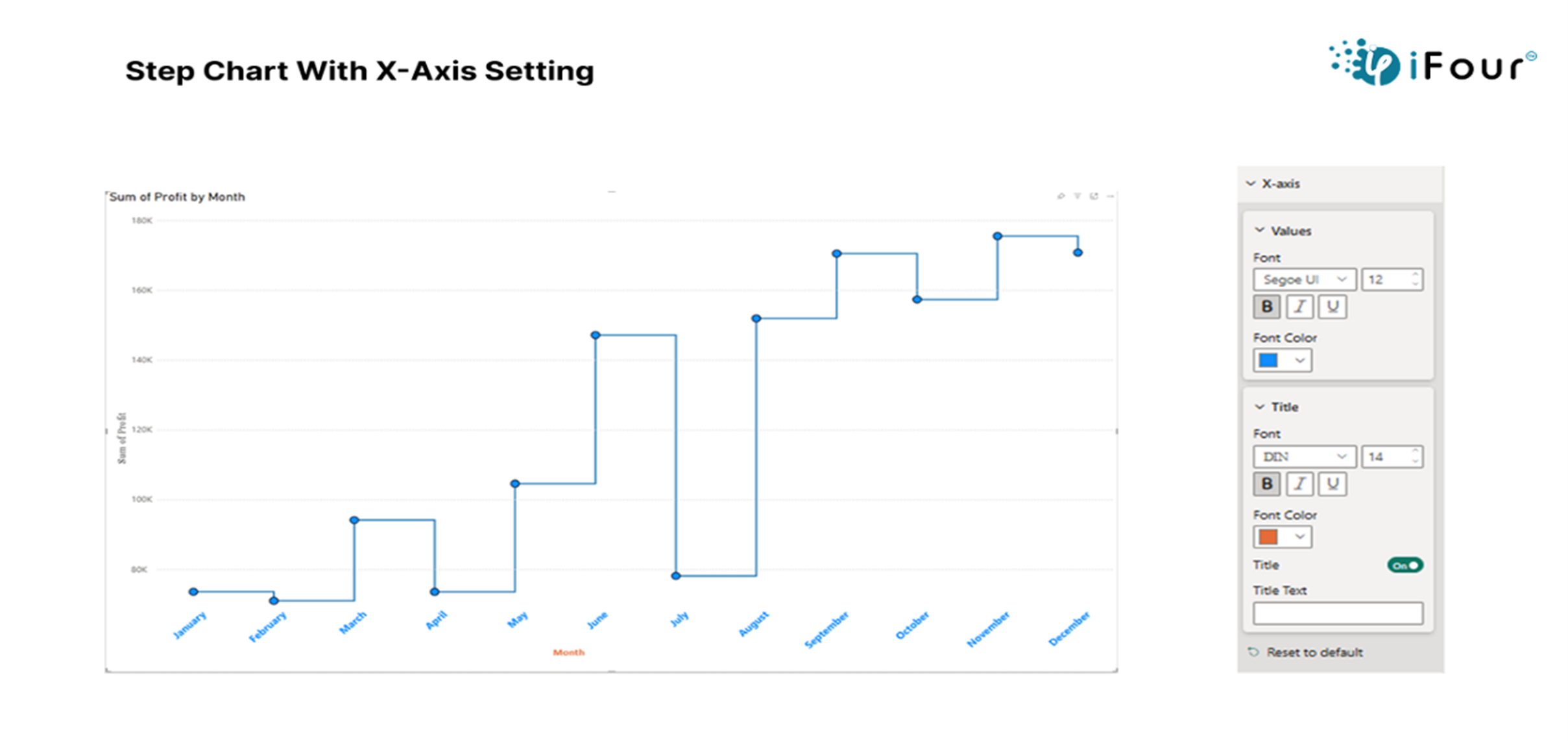
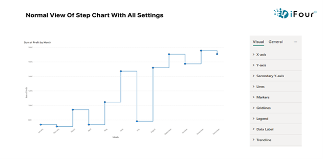
The Step Chart custom visual in Power BI is a great way to show how values change over time using straight horizontal and vertical lines. It is especially useful for data that stays the same for a while and then changes suddenly like stock prices or subscription counts. You can also customize many parts of the chart such as the X-axis, Y-axis, legend, data labels, lines, markers, and gridlines, to make the data easier to read and understand.
Change font size, family, and color of the X-axis for better readability
Set font style, display units, and decimal places on the Y-axis
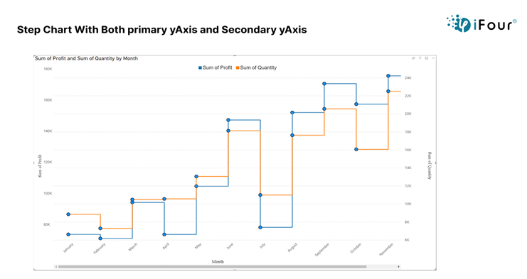
Apply the same formatting to the Secondary Y-axis as the primary one
Modify legend text appearance to distinguish data series clearly
Adjust line thickness and choose from solid, dashed, or dotted styles.
Toggle data label visibility and style with font, units, and position options
Enable or disable gridlines and customize their color, style, and thickness.
See how we've transformed businesses with Azure cloud solutions
In retail Industry, a Power Bi Step Chart can be used to track price changes of a product over time, such as a pair of shoes. The X-axis represents time while the Y-axis shows the price. The chart clearly illustrates periods of price stability with horizontal lines and sudden price changes with vertical steps. This helps retailers analyze the impact of pricing adjustments on sales, identify trends, and make informed decisions for future pricing strategies.
Assistance with deployment and integration into Power BI
Visual tested for compatibility with Power Bi standards
Clearly highlights sudden data shifts and periods of stability
Enables better insights and data driven decisions
Customizable appearance to match business branding and themes
Here are a few examples to help you easily understand how it can be used.
| Industry | Use Cases |
|---|---|
| Retail | Track product price changes to analyze pricing trends and their impact on sales |
| Manufacturing | Monitor inventory or production shifts to improve stock and supply chain decisions |
| Finance | Analyse stock market price changes or fluctuations in asset values over time. |
| SaaS | Analyse customer subscription changes to enhance retention and marketing strategies. |
| Healthcare | Monitor patient admission and discharge trends to identify care patterns or service demands. |
1. Download from App Source and import your dataset into Power BI. Click to download
2. Add the step chart to your report canvas
3. Prepare data with a time field (Data) and numeric field (Price, sales)
4. Drag the time field to the X-Axis and the numeric field to the values section
5. Customize X-axis setting and adjust the Y-axis setting
6. Modify line settings
7. Add markers to highlight key data points
8. Enable data labels for values at each point
9. Customize the legend for clarity
10. Format chart elements
11. Analyze the trends and share insights


iFour Technolab provides complete Power BI consulting , providing dashboard development services serving various industries like fintech, healthcare, legal and so on.
We are a Microsoft Solutions Partner in “Data & AI” and “Digital & App Innovation”, ISO 9001:2015 and ISO 27001 certified. With global presence in the USA, Netherlands, Australia, and India, we deliver custom AI-driven software and cloud solutions.
We house 7 certified SCRUM Masters and over 120 skilled engineers led by an experienced management team.
Our industry focus includes legal, fintech, and healthcare, with a portfolio of impactful custom visuals on Microsoft AppSource—Step Chart, Animated Treemap, Hat Graph, and now, Bump Chart—each built for intuitive, insight-driven analytics.


(Empowering industries with data-driven visuals)
+1 410 892 1119 / +91 95375 81301


![]()


Time series data with numeric values such as price, inventory, or subscriptions is most suitable.
Yes, you can use Legend Field to compare multiples series in the same chart.
Yes, the Step Chart supports full interactivity with filters, slicers, and other visuals.
Yes, but for optimal experience, test and adjust the layout using Power BI’s mobile layout view.
Yes, Power BI supports report page tooltips, which can be applied to Step Charts for richer interactivity.
Reports with Step Charts can be published to Power BI Service and shared as dashboards, PDFs.
Use markers, label density settings, or tooltip to ensure each data point remains visible and readable.
Yes, Step Chart supports both primary and secondary Y-axis for comparing two different measures.
Reach out to us, our team can customize the Step Chart to your specific requirements.
")
Remember our last guide - Power BI forecasting? It revealed things that truly blocks accuracy, both structural and situational. Now it's time to take the next step. Knowing Power...

Did you know that 70% of CTOs (Chief Technology Officers) hesitate to adopt Microsoft Power BI because of its myths and misconceptions that float around. What they fail to see is...

Every CTO knows the struggle of managing complex reports. The inefficiency of scattered data, the constant juggling between reporting tools, the challenge of ensuring accurate KPIs...
