


How to Do Forecasting in Power BI (Steps & Accuracy Metrics)
Remember our last guide - Power BI forecasting? It revealed things that truly blocks accuracy, both structural and situational. Now it's time to take the next step. Knowing Power...

601 & 612, The Times square Arcade, Near Baghban party plot, Thaltej - Shilaj Road, Thaltej, Ahmedabad, Gujarat - 380059
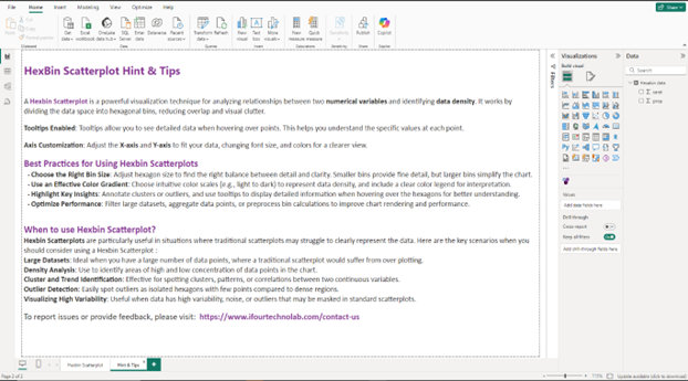
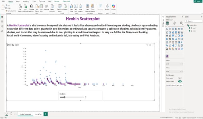
A Hexbin Scatterplot is a chart that shows the relationship between two numerical values by grouping data points into hexagonal bins. It helps reduce clutter in large datasets by showing where values are most concentrated. Darker hexagons mean more data in that area, making patterns and trends easier to spot. It’s a cleaner and clearer version of a scatter plot for big datasets.
Grouping data into hexagonal shapes to reduce clutter and make patterns easier to spot.
The intensity of color in each hexagon reflects the density of data points.
Adjust the size of the hexagon to control the level of detail
Can display a high volume of data without overlapping and overcrowding
Suitable for visualizing relationships between two continuous numeric variables.
Easily shows areas with high or low data concentrations
See how we've transformed businesses with Azure cloud solutions
In the finance industry, a Hexbin Scatterplot in Power BI helps visualize the relationship between expenses and revenue across thousands of transactions. By grouping data into hexagonal bins, it highlights patterns like high-cost low-revenue areas. This allows analysts to spot inefficiencies and make informed financial decisions.
Data density visualization through color coded hexagonal bins
Clear patterns and trends between two numerical variables
Cluster identification in large datasets
Reduced overplotting compared to standard scatterplots
Improved decision making through enhanced visual clarity
Here are a few examples to help you easily understand how it can be used.
| Industry | Use Cases |
|---|---|
| Finance | Examine financial data to detect spending trends or areas for cost optimization |
| Healthcare | Analyze patient data to identify trends in age, medical costs, resource allocation |
| Marketing | Analyze the effectiveness of marketing campaigns by correlating ad spend with revenue |
| Inventory management | Monitor inventory levels against sales volume to detect trends or potential shortages |
| Education | Identify high traffic periods and user engagement trends on websites |
1. Import the Hexbin scatterplot from the Power BI marketplace. Click to download
2. Add the visual to your report canvas
3. Drag and drop two numerical fields (X and Y values) into the visual.
4. Customize the bin size to control hexagon density
5. Format axis, colors, and tooltips for better readability
6. Analyze data clusters and density directly on the chart


iFour Technolab delivers end-to-end Power BI consulting company and dashboard development services to various industries like fintech, healthcare, legal and so on.
We are a Microsoft Solutions Partner in “Data & AI” and “Digital & App Innovation”, ISO 9001:2015 and ISO 27001 certified. With global presence in the USA, Netherlands, Australia, and India, we deliver custom AI-driven software and cloud solutions.
We house 7 certified SCRUM Masters and over 120 skilled engineers led by an experienced management team.
Our industry focus includes legal, fintech, and healthcare, with a portfolio of impactful custom visuals on Microsoft AppSource—Step Chart, Animated Treemap, Hat Graph, and now, Bump Chart—each built for intuitive, insight-driven analytics.


(Empowering industries with data-driven visuals)
+1 410 892 1119 / +91 95375 81301


![]()


Use it when you have a large dataset with overlapping points Hexbin reduces clutter and shows data concentration effectively.
Yes, you can adjust the bin size to control how detailed or summarized the data visualization appears
You need at least two numerical fields, one for the X-axis and one for the Y-axis.
Yes, you can customize color based on data density or value ranges to improve readability.
Yes, like other Power BI visuals, you can export underlying or summarized data
Use the bin size setting, smaller bins give more detail, while larger bins give a summarized view.
Yes, it is fully compatible with both environments.
Reach out! Our team can tailor the Hexbin Scatterplot to your specific requirements.
")
Remember our last guide - Power BI forecasting? It revealed things that truly blocks accuracy, both structural and situational. Now it's time to take the next step. Knowing Power...

Did you know that 70% of CTOs (Chief Technology Officers) hesitate to adopt Microsoft Power BI because of its myths and misconceptions that float around. What they fail to see is...

Every CTO knows the struggle of managing complex reports. The inefficiency of scattered data, the constant juggling between reporting tools, the challenge of ensuring accurate KPIs...
