


How to Do Forecasting in Power BI (Steps & Accuracy Metrics)
Remember our last guide - Power BI forecasting? It revealed things that truly blocks accuracy, both structural and situational. Now it's time to take the next step. Knowing Power...

601 & 612, The Times square Arcade, Near Baghban party plot, Thaltej - Shilaj Road, Thaltej, Ahmedabad, Gujarat - 380059
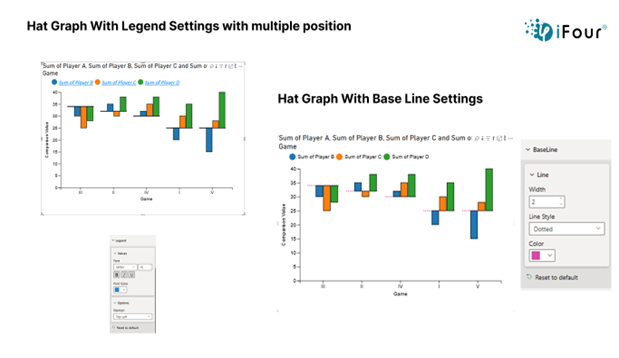
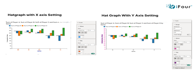
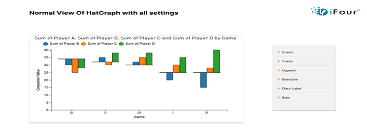

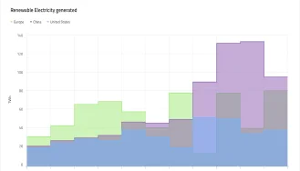
The Hat Graph uses vertical bars with caps to clearly show comparisons, like target vs actual or profit vs loss. It's great for tracking things like income, savings, and expenses over time. You can also adjust the X-axis, Y-axis, and legend to match your preferences and make the chart easier to read.
X-Axis: Customize font size, and color for improved readability.
Y-Axis: Set axis range, define custom intervals, and adjust label fonts as needed.
Legend: Change text style, position the legend, and apply background styling for clarity.
Line: Adjust line thickness and color to enhance chart appearance.
Data Label: Toggle data labels on/off and customize their font and position.
Bar Color: Change individual bar colors to highlight or group specific values.
See how we've transformed businesses with Azure cloud solutions
In retail, a Hat graph can be used to compare how different products categories or store locations perform over time based on metrices like sales volume, revenue, or customer footfall. This visual makes it easy for retail managers to spot which categories are gaining popularity or which stores are falling behind, helping drive timely marketing efforts and inventory planning.
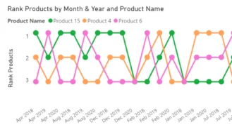
Visually striking Hat Graph to highlight ranking over time.
Interactive, filter-aware charts with smooth transitions
Smooth integration into Power Bi reports and dashboards
Exportable visuals for presentations or stakeholders’ reports
| Industry | Use Cases |
|---|---|
| Finance | Rank of investment products over different quarters |
| Healthcare | Performance ranking of departments or services |
| Marketing | Ranking ad campaigns by engagement over time |
| Retail | Best selling products rank trend across months |
| Education | Student performance ranks across subjects or semesters |
1. Download from AppSource or import it into Power BI. Click to download
2. Add the Hat graph to your report canvas
3. Assign your fields: category, time period, and value or rank.
4. Customize colors, animation speed, and axis formats.
5. Format data labels and curve styles as per your design needs.
6. Combine with filters and bookmarks for an interactive experience


iFour Technolab delivers end-to-end Power BI consulting and dashboard development services to various industries like fintech, healthcare, legal and so on.
We are a Microsoft Solutions Partner in “Data & AI” and “Digital & App Innovation”, ISO 9001:2015 and ISO 27001 certified. With global presence in the USA, Netherlands, Australia, and India, we deliver custom AI-driven software and cloud solutions.
We house 7 certified SCRUM Masters and over 120 skilled engineers led by an experienced management team.
Our industry focus includes legal, fintech, and healthcare, with a portfolio of impactful custom visuals on Microsoft AppSource—Step Chart, Animated Treemap, Hat Graph, and now, Bump Chart—each built for intuitive, insight-driven analytics.


(Empowering industries with data-driven visuals)
+1 410 892 1119 / +91 95375 81301


![]()


The X-axis shows your categories (like months or years). You can change the text size, font style, and color to make it more readable.
The Y-axis shows values. You can set your own range, pick custom number steps (like 10s or100s). and change the font for better clarity.
The legend explains what each color or shape means. You can move it to the top, bottom, left, or right of the chart and change how it looks.
Yes, it supports cross-filtering and drill through actions in Power BI.
Yes, just link your time field to the visual, and it will display changes for that period.
Yes, you can create multiple visuals for different data sets or comparisons.
Yes, it’s supported across Power BI Desktop, Service, and Embedded.
Yes, like other Power BI visuals, you can export your report or visual using Power BI’s standard export options.
Reach out! Our team can tailor the Hat Graph to your specific requirements.
")
Remember our last guide - Power BI forecasting? It revealed things that truly blocks accuracy, both structural and situational. Now it's time to take the next step. Knowing Power...

Did you know that 70% of CTOs (Chief Technology Officers) hesitate to adopt Microsoft Power BI because of its myths and misconceptions that float around. What they fail to see is...

Every CTO knows the struggle of managing complex reports. The inefficiency of scattered data, the constant juggling between reporting tools, the challenge of ensuring accurate KPIs...
