


How to Do Forecasting in Power BI (Steps & Accuracy Metrics)
Remember our last guide - Power BI forecasting? It revealed things that truly blocks accuracy, both structural and situational. Now it's time to take the next step. Knowing Power...

601 & 612, The Times square Arcade, Near Baghban party plot, Thaltej - Shilaj Road, Thaltej, Ahmedabad, Gujarat - 380059
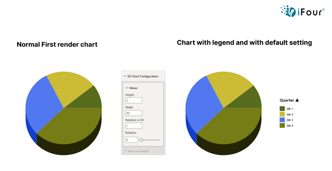
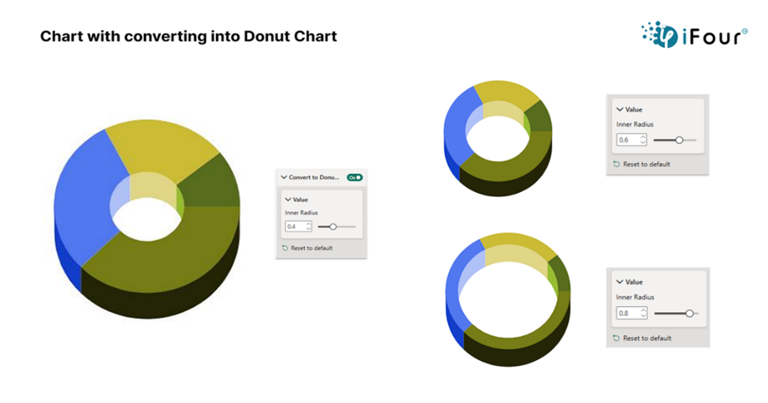
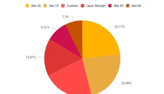
Our 3D PieChart and Donut Chart are perfect for making the reports stand out - especially in dashboards, presentations, or marketing reports where visuals need to be both attractive and easy to read. These charts make your data look more exciting and eye-catching by adding depth and style.
Eye-catching 3D Pie and Donut charts
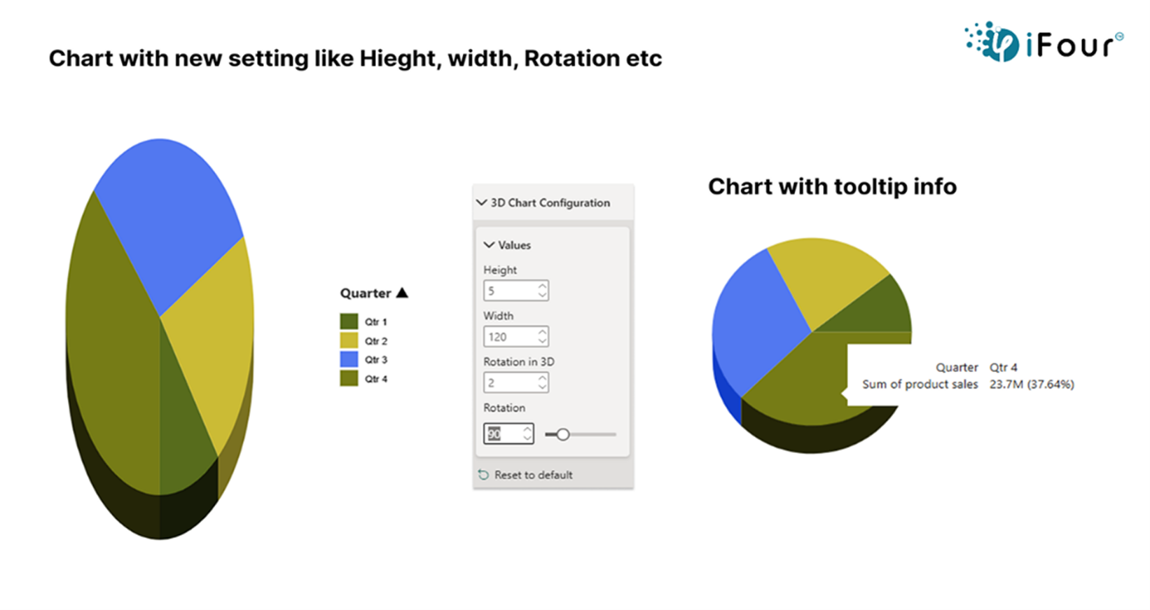
You can rotate and tilt the chart as you like
Pull out slices and adjust the depth
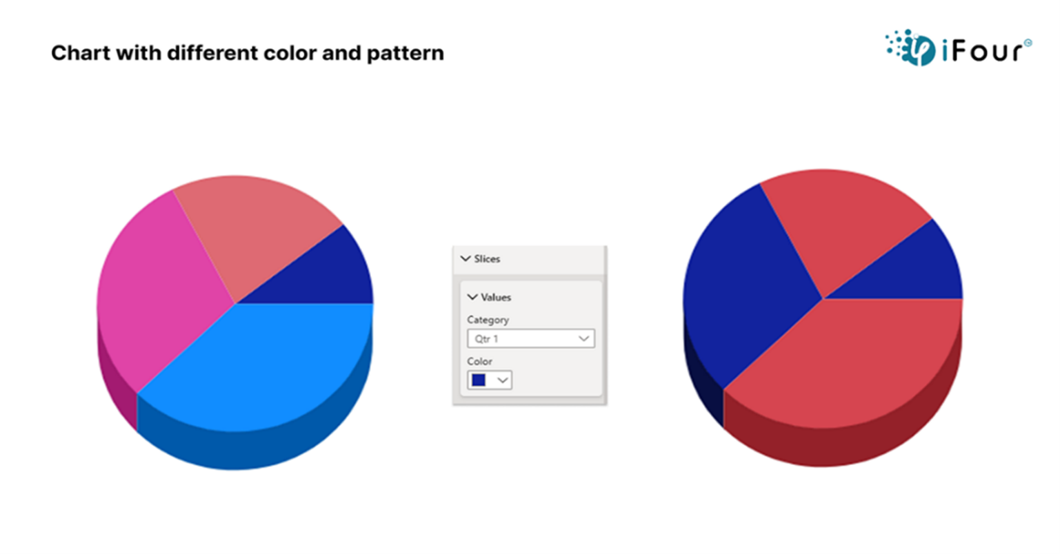
Choose your own colors and legend style
Customize labels
Works with filters and drill-through in Power BI
Reliable performance even with large data sets
Support Power BI themes and bookmarks
See how we've transformed businesses with Azure cloud solutions
A 3D pie chart can be used in healthcare to visualize the distribution of patient diagnoses in real-time. For instance, a hospital can display the percentage of patients with different conditions like diabetes, hypertension, and respiratory diseases, enabling healthcare managers to identify trends, allocate resources efficiently, and adjust treatment plans accordingly.
Engaging 3D Pie and Donut visuals.
Interactive charts with tooltips
Exportable and filter-aware visuals
Smooth integration with Power BI reports and dashboards
Here are a few examples to help you easily understand how it can be used.
| Industry | Use Cases |
|---|---|
| Finance | Revenue share by business unit |
| Healthcare | Budget allocation per department |
| Marketing | Campaign performance breakdown |
| Retail | Product category contribution to total sales |
| Education | Enrollment distribution by course or department |


iFour Technolab stands out as a premier Power BI consulting company , offering dashboard development services to various industries like healthcare, fintech, and legal.
We are a certified Microsoft Solutions Partner in “Data & AI” and “Digital & App Innovation”, and a certified ISO 9001:2015 and ISO 27001 company. As a Microsoft Cloud Solution Provider, we specialize in custom AI-driven solutions, advanced analytics, and cloud services, with offices in the USA, Netherlands, Australia, and India.
Our development center is empowered with 7 SCRUM Masters and more than 120 highly qualified software engineers led by a management team with over 20 years of industry experience. Our primary industry focus areas are legal, fintech, and healthcare.
Our contributions to Microsoft AppSource include custom Power BI visuals like Step Chart, Bump Chart, Animated Treemap, and Hat Graph—each crafted to simplify complex data and support smarter decision-making.


(Empowering industries with data-driven visuals)
+1 410 892 1119 / +91 95375 81301


![]()


You can download it directly from Microsoft AppSource or import it into Power BI using the custom visual import option.
Yes, it’s designed to be user-friendly with simple drag-and-drop functionality and easy customization options and also, we can provide a free demo for your understanding.
Absolutely, you can use any dataset from your report and assign fields like category and values directly to the visual.
Yes, you can always reset or modify chart settings through the Format pane.
Make sure you have added the right fields and values. If it’s still unclear, check if your data has blanks or formatting issues.
Yes, you can export the reports to PowerPoint or PDF and use it directly in the presentations.
No, the visuals are built for reliable performance even when you are working with many categories or large data volumes.
The visual is designed to show one measure at a time for clarity. However, you can use different filters or charts to compare multiple metrices.
No, the visual is free to use for one month. For custom features or additional support, you can reach out to us we will assist you further.
You can contact us for any customization requirements. Our team will work closely with you to understand your goals and provide the right solution.
")
Remember our last guide - Power BI forecasting? It revealed things that truly blocks accuracy, both structural and situational. Now it's time to take the next step. Knowing Power...

Did you know that 70% of CTOs (Chief Technology Officers) hesitate to adopt Microsoft Power BI because of its myths and misconceptions that float around. What they fail to see is...

Every CTO knows the struggle of managing complex reports. The inefficiency of scattered data, the constant juggling between reporting tools, the challenge of ensuring accurate KPIs...
