


How to Do Forecasting in Power BI (Steps & Accuracy Metrics)
Remember our last guide - Power BI forecasting? It revealed things that truly blocks accuracy, both structural and situational. Now it's time to take the next step. Knowing Power...

601 & 612, The Times square Arcade, Near Baghban party plot, Thaltej - Shilaj Road, Thaltej, Ahmedabad, Gujarat - 380059
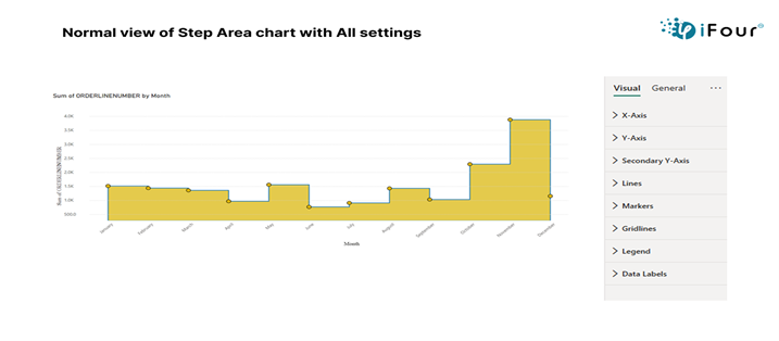
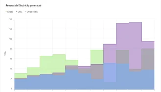
The Step Area Chart in Power BI is useful tool to show how data changes over time. It uses stepped lines, where each line represents a value at a specific point in time, and fills the area beneath the line with color. This shading makes it easy to see trends and how data accumulates over time. This chart is great when you want to see how things change at distinct points, like tracking sales or progress over months. It helps you quickly understand the rise or fall of data at each step.
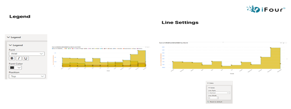
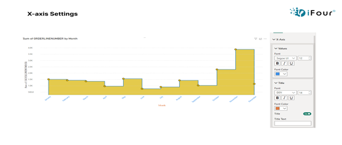
X-Axis: Customize font size, and color for better readability.
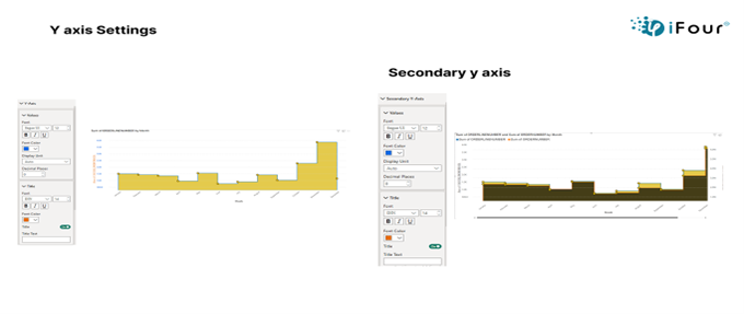
Y-Axis: Adjust font, display unit, and decimal places for precise value formatting.
Secondary Y-Axis: Same as a Y-axis, with full control over font, unit, and decimals.
Legend: Modify legend text appearance for clear series identification.
Line: Change line thickness and style (solid, dashed, dotted) to show trends clearly.
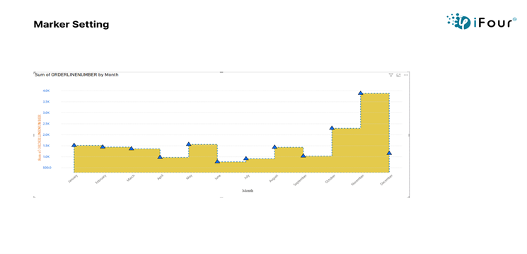
Marker: Choose marker shape, size, border color, and width to highlight data points.
Data Label: Toggle labels, set fonts, display units, label density, position, and background.
Gridlines: Enable/disable lines, adjust thickness, color, and style for clean references.
See how we've transformed businesses with Azure cloud solutions
In the Healthcare Industry, a hospital can use a Step Area Chart to track daily patient admissions over time. This visual clearly shows sudden increases, such as during a flu outbreak or seasonal illness, by highlighting each jump with stepped lines and filled areas. It helps hospital staff quickly identify patterns, plan resources, and respond to patient surges more effectively.
Visualizes trends and changes over time with stepped lines.
Support interactive tooltips and filtering for deeper insights.
Allows full customization of labels, colors, and layout.
Provides a clean, export-ready visual for reports and dashboards
Here are a few examples to help you easily understand how it can be used.
| Industry | Use Cases |
|---|---|
| Finance | Analyse revenue trends, sales linked to promotions and market shifts |
| Healthcare | Monitor changes in patient admissions, discharges, or appointment volumes over time |
| Retail | Track and visualize product price changes over time to study pricing trends |
| Manufacturing | Monitor inventory or production levels and highlights sudden changes like restocking. |
| Marketing | Visualize user activity changes based on campaigns, updates |
1. Import the visual from the Power BI Marketplace Click to download
2. Add your data to the report (e.g., data, values)
3. Select the step area chart from visualizations pane.
4. Drag and drop fields into the X-axis (time) and Y-axis (values).
5. Customize settings like X/Y axis, legend, line style, data labels, and colors.
6. Format tooltips and gridlines for better readability.
7. Review and publish the chart as part of your Power BI report.


iFour Technolab specializes in Power BI consulting company , providing dashboard development services to various industries like fintech, healthcare, legal and so on.
We are a Microsoft Solutions Partner in “Data & AI” and “Digital & App Innovation”, ISO 9001:2015 and ISO 27001 certified. With global presence in the USA, Netherlands, Australia, and India, we deliver custom AI-driven software and cloud solutions.
We house 7 certified SCRUM Masters and over 120 skilled engineers led by an experienced management team.
Our industry focus includes legal, fintech, and healthcare, with a portfolio of impactful custom visuals on Microsoft AppSource—Step Chart, Animated Treemap, Hat Graph, and now, Bump Chart—each built for intuitive, insight-driven analytics.


(Empowering industries with data-driven visuals)
+1 410 892 1119 / +91 95375 81301


![]()


Yes, you can adjust the font size, font color, display units, and decimal places for both axis for clear data presentation.
You can change the font and style of the legend text to make data series easier to identify.
Yes, you can turn on data labels, adjust their font, placement, and even background color for better visibility.
Yes, you can change the line thickness and choose from solid, dashed, or dotted styles to differentiate data trends.
Yes, you can format tooltips to show specific fields, additional metrices, or custom text.
Yes, it works in Power BI dashboards, reports, and can be exported to PDF, PowerPoint, or embedded online.
Yes, the step area chart is responsive and adjust well on mobile reports in Power BI.
Yes, gridlines are fully optional. You can disable horizontal and vertical gridlines individually.
Definitely. Our team can help tailor the visual to your unique needs and business scenarios.
")
Remember our last guide - Power BI forecasting? It revealed things that truly blocks accuracy, both structural and situational. Now it's time to take the next step. Knowing Power...

Did you know that 70% of CTOs (Chief Technology Officers) hesitate to adopt Microsoft Power BI because of its myths and misconceptions that float around. What they fail to see is...

Every CTO knows the struggle of managing complex reports. The inefficiency of scattered data, the constant juggling between reporting tools, the challenge of ensuring accurate KPIs...
