


How to Do Forecasting in Power BI (Steps & Accuracy Metrics)
Remember our last guide - Power BI forecasting? It revealed things that truly blocks accuracy, both structural and situational. Now it's time to take the next step. Knowing Power...

601 & 612, The Times square Arcade, Near Baghban party plot, Thaltej - Shilaj Road, Thaltej, Ahmedabad, Gujarat - 380059


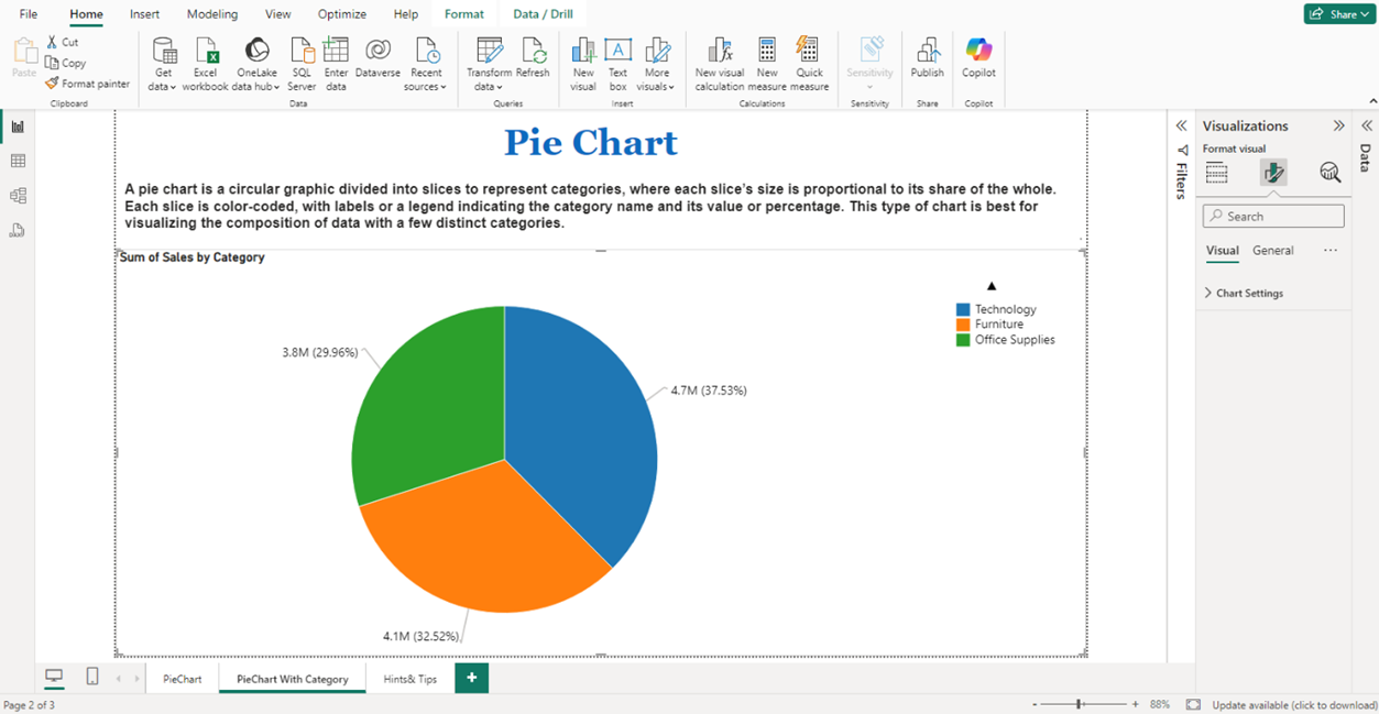
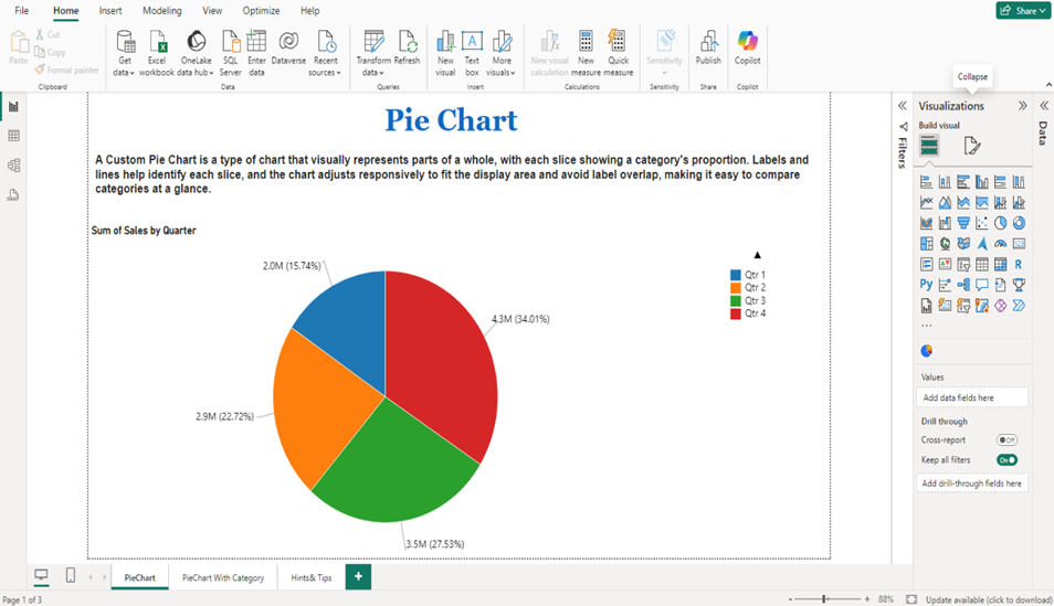
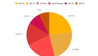
A Pie Chart is a circular chart that shows how a whole is divided into parts. Each slice of the pie represents a category, and the size of the slice shows how much of the total it makes up. The bigger the slice, the more it contributes. You can also interact with the charts like clicking on the slices to filter data and often see details by pointing your mouse over a slice.
Clear Category Representation: Distinct, color-coded slices with readable labels for each category.
Interactive Tooltips: On-point tooltips showing category name, value, and percentage for quick insights.
Slice Exploding: Option to highlight or “explode” slices to emphasize specific categories.
Dynamic Data Adaptability: Automatic updates to slice sizes, colors, and labels when data changes.
See how we've transformed businesses with Azure cloud solutions
A marketing team can use a pie chart to track the share of leads generated from different sources like social media, email campaigns, paid ads, and events. As new leads come in, the chart updates to reflect the changing contribution of each source, helping marketers quickly spot high-performing channels and optimize their strategy in real time.
Interactive Pie Chart Visual displaying data distribution across categories
Integrated Filters / Slicers to interactively explore data segments
Exportable Reports with embedded pie charts for sharing and presentations
Customizable visual elements
| Industry | Use Cases |
|---|---|
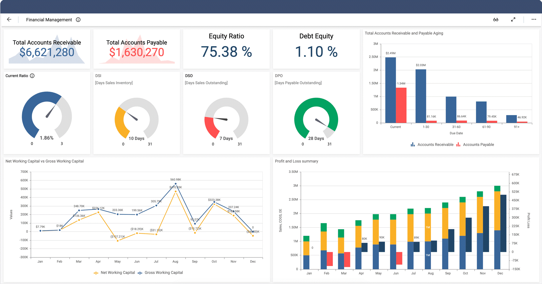
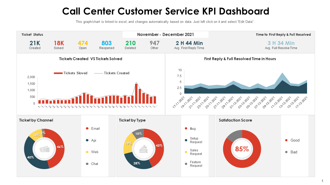
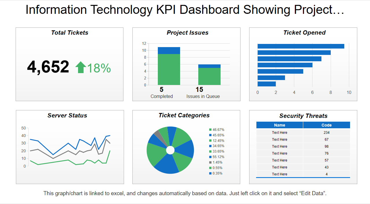
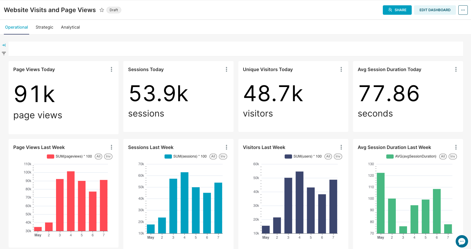
| Healthcare | Monitor changes in patient admissions, discharges, or appointment volumes over time |
| Finance | Illustrate how total expenses are divided among different cost centers |
| Marketing | Show how different campaigns performed in terms of customer engagement |
| Education | Compare student’s enrollment numbers across different academic programs |
| Logistics | Breakdown shipments by transport mode like air, sea, and road |
1. Download from App Source and import your dataset into Power BI. Click to download
2. Select the Pie Chart visual from the visualizations pane
3. Drag category fields (e.g. Lead Source) to the legend area
4. Drag numeric fields (e.g., Lead Count or Revenue) to the values area.
5. Customize labels, colors, and legends using Format pane.
6. Use slicers, filters, or tooltips for interactivity and drill-down analysis.


iFour Technolab delivers end-to-end Power BI consulting and dashboard development services to various industries like fintech, healthcare, legal and so on.
iFour Technolab is a Microsoft Solutions Partner in “Data & AI” and “Digital & App Innovation”, and a certified ISO 9001:2015 and ISO 27001 company. As a Microsoft Cloud Solution Provider, we specialize in custom AI-driven solutions, advanced analytics, and cloud services, with offices in the USA, Netherlands, Australia, and India.
Our development center is empowered with 7 SCRUM Masters and more than 120 highly qualified software engineers led by a management team with over 20 years of industry experience. Our primary industry focus areas are legal, fintech, and healthcare.
Our contributions to Microsoft AppSource include custom Power BI visuals like Step Chart, Bump Chart, Animated Treemap, and Hat Graph—each crafted to simplify complex data and support smarter decision-making.


(Empowering industries with data-driven visuals)
+1 410 892 1119 / +91 95375 81301


![]()


Ideal for showing parts of a whole, such as percentage distributions among categories.
Yes, clicking on a slice can filter other visuals in your report based on that category.
Yes, they automatically adjust slice sizes and labels when the underlying data changes.
Yes, you can slices based on values or categories to highlight specific data points.
While Pie Charts don’t support drilldowns, you can use other visuals or features like tooltips to explore detailed data.
In the formatting options, enable data labels display category names and values directly on the chart.
Yes, automatically adjust slice sizes and labels when the underlying data changes.
Pop-up boxes that appear when you point over a slice, showing details like category name, value, and percentage.
Reach out to us! Our team can tailor the Hat Graph to your specific requirements.
")
Remember our last guide - Power BI forecasting? It revealed things that truly blocks accuracy, both structural and situational. Now it's time to take the next step. Knowing Power...

Did you know that 70% of CTOs (Chief Technology Officers) hesitate to adopt Microsoft Power BI because of its myths and misconceptions that float around. What they fail to see is...

Every CTO knows the struggle of managing complex reports. The inefficiency of scattered data, the constant juggling between reporting tools, the challenge of ensuring accurate KPIs...
